A: “Dude! Have you ever wondered if what I see as ‘red’ is the same color that you see as ‘red’?”
B: “No dude! It’s scientific. ‘Red’ is just a label for a certain wavelength on the spectrum.”
A: “I know, Dude. But how do we know what our brains ‘see’ when our eyes perceive that wavelength? Maybe what I call ‘red’ is what you see when you say ‘green.’ We’d never know because we always call the same color ‘red’ or ‘green’ when we see it. But what color are we ACTUALLY seeing?”
B: “Dude…”
Have you ever had THAT conversation before (with or without the ubiquitous use of “dude”)? That’s exactly what this post is NOT about.
Before I go on, I’d like to announce that I am deeply in like with my new iPhone 5s. I’ve only had it for a little over a month, but I finally know what all the fuss is about (it’s my first zhìnéng shǒujī 智能手机 ever).
Naturally, one of the first apps I got was Pleco (coming soon: a post about why I love Pleco). One of the options that was on by default was the “Tone Colors.” (If you’re not familiar with what tone colors are, please see John Pasden’s review of Chinese Through Tone & Color by Nathan Dummitt.)
I love tone colors, and left them on in Pleco. But the problem (as John and his commenters discuss) is: What’s the biāozhǔn 标准? What colors should be assigned to each tone?
Here’s a summary of what 4 people think: [updated to include Hanping]
 According to Pleco’s creator Michael Love, Pleco first introduced tone colors in Pleco 2.0 Beta 1 (October 2007). Drummitt’s book came out six months later in March 2008, and then MDBG added tone colors a year later.
Right now, I’m an avid user of MDBG and Pleco. But the tone colors don’t match. I don’t want to discuss what the “right” colors for each tone should be, I just want it to be consistent. But I’ve found that people feel very strongly about “their colors.” And I think a consensus is impossible to reach.
But no problem. Pleco has set an example of how apps should handle this issue. Look at the option in Pleco’s Settings > Colors > Configure colors > Tone 1 color:

That’s the solution! Just let everyone set their own tone colors. Since MDBG doesn’t offer this option (yet), I’d have to set Pleco’s colors to match MDBG’s. UPDATE: MDBG now offers Pleco’s colors as one of the options (see here).
(Note: the Pleco colors are in HSB by default, but if you touch the number itself you can toggle through RGB or Hex.)
I hope all you who are developing apps that include tone colors will follow Pleco’s lead on this: go ahead and pick your favorite defaults (Michael Love said “I believe the (Pleco) colors were originally chosen based on what colors of pen the friend of mine who came up with it had available”), but please PLEASE let us users customize them.
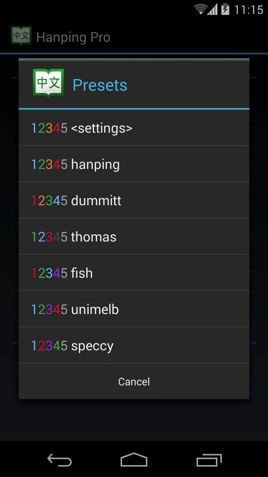
UPDATE: Hanping has a big preset menu to allow users to choose their favorite color schemes (but I don’t know what some of those presets are).
Argh. I hate being given a color wheel. There is such a wide variety of colors available that it’s dizzying. Is it so much trouble to include presets that match other popular conventions?
And seriously…purple? What was Pleco thinking?
In 6-and-a-half years of supporting tone colors I believe you’re actually the first person to ask for alternate presets – I suppose we could at least offer an option for the MDBG/Dummitt one, since that seems to be the unofficial standard for most apps / websites other than ours, but I’m hesitant to add a lot of them since the general thrust of our recent updates has been towards fewer / simpler options.
Purple is ugly, but it’s much more visible / memorable than orange or yellow – was a bigger deal back on Palm/WM when screens had much much poorer color gamuts, but changing the default now would throw everybody off. Our system also has the benefit of easy recall since we match rainbow order (RoyGBiV) – could do the same thing with red/orange/green/blue but it seems odd to group 1/2 with warm colors and 3/4 with cool.
Ah, you didn’t include my tone color scheme… I am crushed. 😛
But a lot of people I talk to on this topic feel that red should definitely be fourth tone (the “angry tone”). It’s kind of baffling to me that all three color schemes shown above make first tone red.
It is always of great help to read this blog, full of wisdom, reminding me that there are people who see this world as one of wind, sunshine and colors, not just of money.
Hanping has been doing this for some time now.
I’m definitely with John as to having 4th tone be red. When non-customizable tone colors came out it used to bug me that the colors were not only “wrong”, but illogical (from my biased synesthetic point of view).
1st tone for me is yellow or orange (with the color wheel I can choose a school-bus yellow so it isn’t too light) [air].
2nd tone is blue [water].
3rd tone is green [earth].
4th is red [fire].
5th is grey or black.
Having tone colors in general (no matter what the are set to) makes the tones a lot easier to decipher at a glance — the pinyin tones are often just to small. Also, for those of us whose native language is not tonal, we tend to remember the phonetic values and forget the tones. I very often am sure of the pronunciation of a character but just can’t remember if it is this tone or that until I look it up, so just catching a glimpse of color really speeds things up.
Michael — can you get data showing whether users have kept the default color setting or switched it (and to what)? If so, it would be interesting to see what colors are most popular for which tones.
True, but the fact that nobody’s asking for it even with it available in other apps (and that Hanping seems to have actually switched to a color wheel / buried their preset menu in a recent update, suggesting that they’ve seen similarly little interest) makes me skeptical as to whether it’s something people actually want.
Something I had been considering is presenting a palette of say red / orange / yellow / green / light blue / dark blue / purple / gray / black (particular shades chosen to go well with each other and with the color scheme) and letting people arrange those in their preferred order (dragging them into slots would be cool, though kind of a fussy thing to code) – that eliminates the fussiness of the color wheel but still accommodates any arbitrary scheme. Also gets around the minor annoyance in our current version that you have to separately configure colors for day and night mode (we found the defaults were hard to see against a dark background and so replaced them with pastel versions).
The one other tone color change we’d been considering was coloring Pinyin syllables as well – there’s been a trickle of suggestions on that pretty much since 2007 but some recent changes to the way we handle our Pinyin generation code has made it much easier to implement.
If we really wanted to be insane we could also try to come up with a color scheme for Cantonese tones – there we’ve got 6 and with some very clear spatial relationships to each other.
We’re pretty militant about customer data privacy so we don’t currently do any metrics on people’s settings, though I suppose we could survey them on some sort of opt-in basis at least – that naturally leads to biased results, though.
Pleco’s color scheme is now added as an optional color scheme on the MDBG website. You can select it by clicking the “Display Settings” link in a search result.
Custom tone colors might be added in the future, but probably as a fixed palette to choose from instead of a color wheel. I find color wheels way too nerdy 😉
Hello to all the respectable people here,
There’s no Chinese word translated as ‘nerdy’ (or ‘nerd’) in the MDBG’s Cedict by the way ))
As to color tones, Pleco’s system use of blue color (no matter which tone each of the hanzi is) in some application’s own color schemes (night mode) makes this color’s use not so handy – for since there are blue hanzi with random tones, the mnemonics may fail there where the specific hanzi is blue because of its tone.
So I use purple instead of blue (for 3rd tone, as purple is the coldest – deepest – color).
For 1st tone – yellow or orange (the color of the sun, high and continuous in the sky) depending on day/night background,
2nd tone – green like grass growing up.
3rd – purple as mentioned above (deep/cold)…
4th – red as many suggested here and elsewhere – the most energetic (or maybe even aggressive) tone and color combination
Cool, thanks! Now we just need Dummitt to release a ‘Pleco Color Scheme Edition’ of his book and we’ll have everybody using purple 🙂
Albert, thanks for bringing the color setting in PLECO to my attention. I’m delighted with the new look of my “go to” iPhone dictionary.
Any color scheme can be learned, the question is: is there a set of colors which is “best”, i.e. can be learned most readily and retained most effectively by a majority of new students of Chinese. I think there is. I nominate:
1. Blue – High as the sky.
2. Green – Rising like grass.
3. Brown – Low like dirt.
4. Red – Like anger.
5. Clear/white – Light as air. (use outline fonts or grey if not available)
Terry Thatcher Waltz of Albany Language Learning inspired the first two choices, and the idea that low should be associated with dirt (she uses black).
You can see these colors implemented in the updated version of the “Laokang Tone Trainer” app for iOS devices coming later this month.
You are correct, until a standard emerges it’s good for electronic language tools allow for users to select their preferences. Yet the Chinese language learning world will be better off with a standard, don’t you think? That way colors can make their way into printed textbooks and other materials and reinforce good tones.
I 100% support the need for customized color. I like Paul Condrell’s scheme. Mine is similar:
1. light blue as the sky
2. orange for rising
3. dark blue as the sea
4. red as strength
5. grey (neutral)
!!
Thanks for writing this article. I was actually just looking for a comparison piece like this a few weeks ago and finally, here it is. While Pleco’s color scheme might not be entirely logical, I’ve stuck with it since it was the first one I learned. I don’t think I would/could switch now.
Also very glad that MDBG enabled the ability to choose the Pleco color scheme. I can only feel partly responsible since I suggested that option only a couple months ago on their Facebook page. 🙂
Hi – Hanping developer here.
Hanping’s color scheme is very similar to Paul Condrell’s (above):
Tone 1 (high, flat tone) – blue – think of a flat blue lake, or a blue sky
Tone 2 (rising tone) – green – think of green grass growing!
Tone 3 (low, falling-rising tone) – orange – (we chose this one for aesthetic reasons)
Tone 4 (falling tone) – red – think of someone giving an angry command
The codes are:
1. 100 180 255
2. 048 176 048
3. 240 128 000
4. 208 000 032
5. 160 160 160
For the first few years we provided color presets, but just over a year ago introduced a color wheel because of a couple of customer requests and because this particular color wheel is very cool!
We’ve been supporting colored pinyin/zhuyin for over half a year now. You can see a screenshot here.
@hanpingchinese,
Just added your colors to the chart above. Also, I like your massive preset menu. Can you enlighten us as to what all those presets refer to?
Thanks!
Settings shows the user’s current coloring scheme (which may be a preset or custom values)
Thomas – Michel Thomas
Fish – Similar to Pleco
Unimelb – University of Melbourne
Speccy – This was a customer request
We try to keep the blues, reds etc consistent across presets. So the values do not exactly match those in your table. Users who want exact matches can use the custom controls.
I’ve got no strong opinion which color goes with which tone, but for readability I need all the colors to have the same lightness. So I recommend that tone color schemes rely on Ethan Schoonover’s palette Solarized, which has been carefully designed to have that feature and some other nice ones: http://ethanschoonover.com/solarized
PeraPera Chinese plugin for Firefox and Chrome seems to agree with the Pleco color scheme.
Strangely enough, I find myself relying more on the “phonetic” pinyin ( zhège biànzhǒng ) and less on the colors or the “numeric” pinyin ( zhe4ge[5] bian4zhong3 ) but I still would not wish to be without the colors.
Now all I need is a coloring scheme that actually breaks up the sentences into words ( »这个« »变种« ) 🙂
Dear fellow student,
I also use 1 colour per tone. I would like to share my visual aids for the most common Chinese characters with you (help for writing + tone). Check it out: http://chinesecoloured.blogspot.sg/
1st tone – red for high like lanterns floating high in the streets
2nd tone – yellow for rising like rising sun rays
3rd tone – green for falling rising like grass waving in the wind
4th tone – purple for falling like rays of light flowing down from the stars
5th tone – grey for neutral
Pingback: Color temperature of Mandarin tones - Zydeo blog
Pingback: Tone Colors: A Quick Reference for Tones as | En Route To Fluency
Pingback: On Tone Colors | En Route To Fluency
Pingback: On Tone Colors – My blog