
For years, I have long wanted to write about one of the major redesign efforts that take place within CBS interactive (previously CNET Networks). However, I am never able to really discuss the particulars of these types of projects while they are in the works, (and certainly can not share any of the design comps or product plans) Inevitably my small team moves on to another large project so quickly, that by the time I am able to do so, I have lost interest in taking that time needed to walk through what is a HUGE effort by multiple disciplines of teams within the larger Business unit.
This project was a major effort given our desire to overhaul many infrastructure components that are seldom seen behind the scenes. To begin with, we completely overhauled what was actually many older legacy technology platforms into a faster and more streamline back-end. This also included major updates to our primary CMS that allows the various content types & large network of Business Technology bloggers to be published and programed by page editors who bring an enormous suite of content to life daily.
Lastly (and my teams role), the entire front end is built into a new design framework that is intended on not only being far more modular and flexible – but also applies a more current standard that could be applied to our broader suite of Business and Technology brands to allow for faster future deployments as well as a better ability to serve advertisements / sponsorships across an entire network of sites rather then to simply to a single web property.
Structure
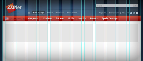
The design framework is built on a the very standard 960 grid which breaks up all content into 12 columns of 60px with 10px of margin to the right and left of each – thus creating 20px gutters between all columns. The one modification we chose, was to make the main wrapper 980px to allow for an even 20px on the outer margins. This gives a more even appearance and extends the horizontal to the final 980px width. This is also important as it is more flexible for the still varied ad widths that must be supported until the IAB define a standard for 1024px width sites. Further, this makes the main site grid divisible by 3 larger columns of 300px – key given that ZDNet is a large media buy that must support the ever standard 300 x 250 MPU ad creative.
Navigation
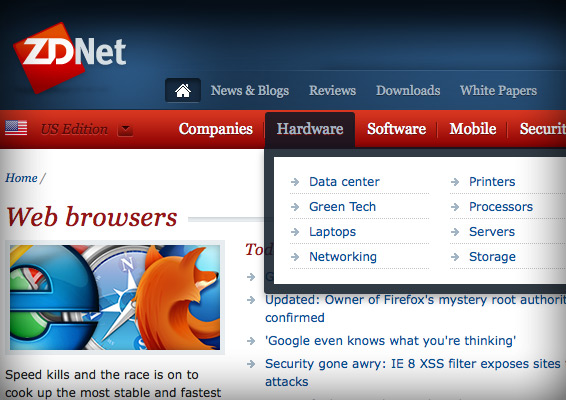
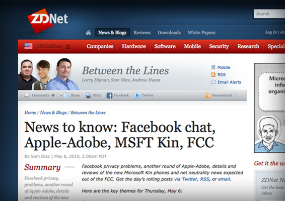
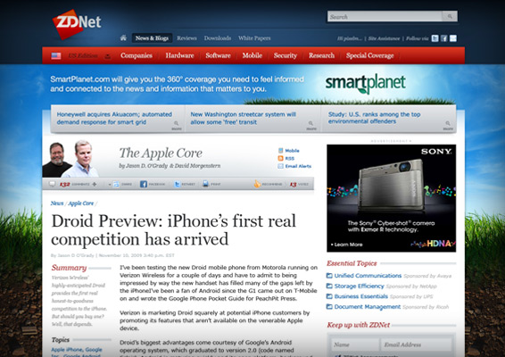
At first glance, the largest change is to our primary navigation that is now based on topics rather then content types. Lets face it, most users do not come to a site with the intent to look for blog, video, white papers, case studies or podcast “types” of content. There are exceptions such as folks seeking reviews etc – but most are interested in learning more about topics such as VOIP, Cloud Computing or to research a company or software. Thus our primary navigation is based on the core topics being covered by ZDNet – with each primary silo showing a drill down of deeper topical options with in each bucket. We believe that this will make it easier to find more of the depth of coverage that is actually published both daily as well as the good evergreen assets created over time.
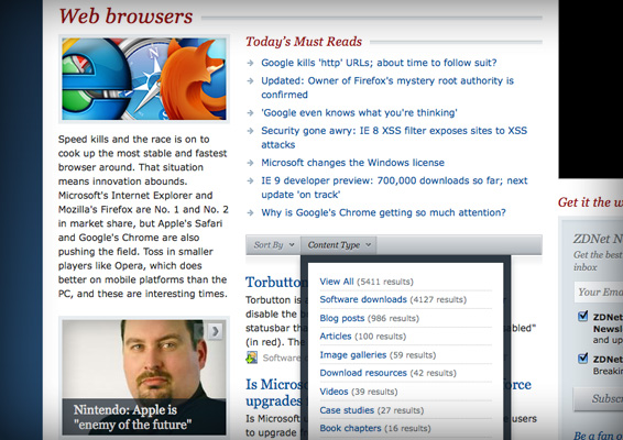
Once you are in our topic pages, users can find daily must reads, the various blogger’s who are covering those topical beats as well as a river of all ZDNet has to offer on each subject. This river can also be further distilled by sorting on relevance, date and popularity – or to be filtered by any and all of our many content types which show how many assets exist (typical to a standard search listing).
Moving to a topical based navigation was “not” done at the cost of eliminating our access to our assets by content type. All these older pages remain. They are placed above the topics, but display smaller as a secondary method of finding your way. That said, we needed to condense our masthead to allow for substantially more navigation options including search – I wont go into how the function of our search is improved (I am not an engineer) – however, we did simplify our display by creating a hover when users mouse over the search text input.
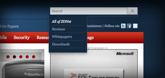
Once the hover appears, a user can simply leave it in its default “All of ZDNet” search, or target the query to a particular area of depth with in the site. This minimizes our search function to a far smaller 300px wide unit found as a constant in the upper right corner of all ZDNet pages allowing for the topical / content type navigation as well as the convenience nav items – Log in, Account management, Assistance and the ability to sign up to follow via newsletter, twitter or facebook.
Content
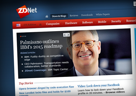
Once a user clicks into our any of assets, the content pages remain largely the same. Though there are some noteworthy clean ups that were made. The upper portion of the page, was lightened and reduced in size (vertically) to allow us to better “cut to the chase” and get to the meat of the article. We simplified our toolbar in an effort to make it easier to see how many comments there are, vote or share, as well as to access the blog’s RSS feeds and Email alerts. Each article leads with large headlines followed by a summary on the side bar, along with all the tags to refine more content on topic.
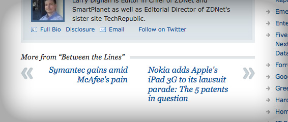
At the base of each article, we also made the next and previous posts a large call to action so that a end user can quickly find more latest posts published by Larry Dignan or whomever they are reading. Also included is a simplified bio box with methods to either learn more about the author or to follow / contact them.
Another big overhaul was made to our commenting system. For years, we have had a very traditional title only tree structure view. In the nearly 5 years that I have been at CBS, every redesign has included massive complaints from our users that we did not move to a more contemporary flat nested view which was requested to be more typical and allow users to view the complete comments inline within the article.
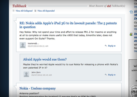
Thus, this redesign did just that – We have moved to a flat / nested view presentation. One that supports gravatars and the ability to reply directly, edit or report a comment as spam. Prior to launch we were told that there is a Google News penalty for having too many comments showing in the article – The spec was to show all, but we had some compromises that had to be made at the last minute. However, an end user can view more posts by either clicking a large “View More” that loads more post directly in the article, or can click the view all collapsed / expanded to go directly to a secondary flat / nested view experience stripped of all ads to allow for maximum readability. There remain some issues with this system, but overall – it feels like a progressive step to a new more modern platform that can and will be built upon.
We do have a number of other content types ranging from articles, white papers, downloads, videos etc. – all of which were updated as well. We progressed to a more unified video player that displays 30% larger on video pages, while maintaining the same previous size when embedded into articles. Additionally, we have plans to make future upgrades to our library section.
Ad Innovation
Lets face it… Most end users are not fans of this portion of our efforts. However, sites like ZDNet are free to end users, and are largely supported by a display advertisement / sponsorship business model. That said, we make a commitment to make it the best experience for both our user’s consumption and our marketers ability to reach that targeted audience. ZDNet has assembled one hell of a network of some of the smartest voices in Business Technology. But while free for the end user to consume, it is not free to build and maintain this body of content. The web has evolved beyond being digital brochure ware. As a result gone are the days of media buyers being satisfied with tiny text links on any outlet’s pages.
The web is becoming more like other mediums where more intrusive commercial breaks are the acceptable norm to be able to freely browse a desired body of content and programming. To that end – from time to time you will see larger and more prominent premium ad creative served on ZDNet.
However, we hope to serve our premium content & informed users well, by delivering targeted ads to folks who ideally have interest in the wares and services that our advertisers promote – further that are also clearly distinguished from our own editorial voice and modes of navigating through the site experience. I think it is safe to assume that this will not be unique to ZDNet but more and more and acceptable norm online.
Wrap it up!
So there you have it… Months worth of R&D and work by all sorts of folks from product, editorial, engineering and of course design. We think we have pushed the site forward with some great new features and functions. There remain a few bugs that will continue to be tweaked, but more importantly – Like all else on the web… this is not an end result, but a new platform to build on. So you can count on seeing more changes and updates based on user and industry feedback. As for me, I continue to wake up and chuckle that I get paid to do something this fun with a group as talented as the folks with in the CBS Interactive Business and Technology family!
 I am an avid student and evangelist of user-centered design principles - I have created or overhauled some of the world's largest online Business & Technology properties. My focus has always been on building functional design systems that creatively solve business problems. Solutions that convey brand & messaging, but more importantly, are intuitive to maximize the possibilities of an interactive medium.