This article needs additional citations for verification. (January 2021) |
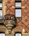
Polychrome brickwork is a style of architectural brickwork wherein bricks of different colours are used to create decorative patterns or highlight architectural features in the walls of a building. Historically it was used in the late Gothic period in Europe, and the Tudor period in England, and was revived in Britain in the 1850s as a feature of Gothic Revival architecture. Later in the 19th century and into the early 20th century it was adopted in various forms in Europe for all manner of buildings such as French eclectic villas, Dutch row houses, and German railway stations, and as far away as Melbourne, Australia, where the technique reached heights of popularity and elaboration in the 1880s.

Beginnings in the British Gothic Revival edit

The revival of polychrome brickwork is generally thought to have been instigated by British critic and architectural theorist John Ruskin, in his 1849 book The Seven Lamps of Architecture, where he lauded not only Medieval and Gothic architecture as 'truer' than the Classical, but also the ‘honest’ medieval use of materials as both structure and decoration, above the use of applied colours or veneered materials. He gave as examples Tuscan and Venetian Romanesque and Gothic buildings such as the Doge's Palace in Venice, which has a facade of white stone and pink marble in a diaper pattern (which is in fact a veneer). Other theorists and architects at the same time were also exploring the medieval use of materials in this way, later described as ‘constructional polychromy’.[1] While some designers had already used more than one colour of brick, William Butterfield made lavish use of the technique in his All Saints Margaret Street, built between 1850–59, with an exterior of banded and diaper patterned brickwork in black and cream on a red brick background.[2] Butterfield went on to use polychrome brick in more projects, and other architects also adopted the new technique at the same time. For example George Edmund Street used black bricks on a red background in his 1858–61 St James the Less in Pimlico, considered one of his finest designs, and George Gilbert Scott used black brick stripes on a red background on the Sandbach Literary Institute in 1857.
The use of coloured brick effects became quite popular in Gothic Revival across the United Kingdom, often in combination with stone, usually with far less elaboration that Butterfield. Some architects in the 1870s-80s were more enthusiastic, such as in the work of Watson Fothergill in Nottingham, and in Bristol in the 1860s-80s it was often used is what is now known as 'Bristol Byzantine' style, for instance the 1869 Welsh Back Granary.
Use in Europe edit
Polychrome brickwork also became popular in Europe in the later 19th century as part of the various medieval and Romanesque revivals. In France the Menier Chocolate Factory in Noisiel, designed by Jules Saulnier and completed in 1872, is an early and very elaborate example, which is also noted for its early use of iron structure. Later the use of two tone brickwork was popular in eclectic picturesque villas, as well as other building types. Examples, again usually restrained use of two colours, can also be found in Belgium, the Netherlands, and Germany 'Gründerzeit' style buildings sometimes employed decorative brick.
Use in Australasia edit

In Australia, the first use of polychrome brickwork is generally attributed to architect Joseph Reed's Independent Church (now St Michaels) in Melbourne's Collins Street, completed in 1866, closely followed by St Jude's Church, Carlton. Crouch & Wilson followed with early examples such as the Victorian College for the Deaf. The style became immensely popular in Melbourne and is featured in many of the terrace houses from the 1870s and 1880s. Crouch & Wilson and Percy Oakden soon also employed it on church design, while Reed also applied it on houses, notably the Rippon Lea Estate. Following Crouch & Wilson's award winning primary school design Henry R. Bastow templated it and as a result majority of the State Schools in his commission during the 1870s-80s were in the gothic style with at least two colours.[3]
Rare examples of its use can be found in elsewhere, however it is most prevalent in the Architecture of Melbourne, where it began, and where it became increasingly popular, reaching a peak in the boom years of the 1880s when it was used extensively on all manner of buildings from terrace houses to villas, from shops to factories.
-
 Lisburn House, Dunedin (1865) by Mason and Wales
 -
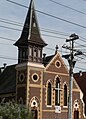
 All Saints' Church, Dunedin (1865) by Mason and Wales
 -

-
 St Jude's Church, Carlton Melbourne (1866) by Reed & Barnes
 -
 Victorian College for the Deaf, Melbourne (1866) by Crouch & Wilson
 -
 Ripponlea Estate, Elsternwick, Melbourne Victoria (1868) by Joseph Reed
 -
 Tortola House, Adelaide (1868)
 -
 Chinese Mission Church, Little Collins Street, Melbourne, Crouch & Wilson, 1872
 -
 Methodist Church, Sydney Road, Melbourne, Percy Oakden, 1872
 -
 Yorkshire Brewery, Collingwood, Melbourne, James Wood 1876
 -
 St Kilda Parish Mission Church, St Kilda, Melbourne 1877
 -
 Bishop's Building, Trinity College, University of Melbourne (1878)
 -
 Terrace House, North Fitzroy, Melbourne (c1880s)
 -
 St Kilda Park Primary School, Melbourne (1882)
 -
 Holcombe Terrace, Drummond Street, Carlton, Melbourne Victoria (c1884) by Norman Hitchcock
 -
 Windsor Station, Melbourne (1885-1886)
 -
 St George's Presbyterian, Melbourne (1886)
 -
 Coop's Shot Tower, Melbourne (1887)
 -
 1-8 Fishley Street, South Melbourne, Victoria (c1887)
 -
 Uniting Church St Kilda East Melbourne (1888)
 -
 Beswicke Buildings, Fitzroy, Melbourne Victoria (1888) by John Beswicke
 -
 Royal Terrace. Charles Street, Abbotsford, Melbourne Victoria (c1889)
 -
 Hopetoun Terrace, 1 -11 Elm Place, Windsor, Melbourne Victoria (1890)
 -
 Denton Hat Mills, Abbotsford, Melbourne, Victoria (c1890) by William Pitt
 -

-
 132-142 and 144-148 Victoria Street Auburn, Melbourne (c1891) by John Beswicke
 -
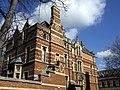
 Former Mount Cook Police Station, Wellington New Zealand (1894)
 -
 Spotswood Pumping Station, Melbourne (1897)
 -
 Ardmore terrace houses, Fremantle, Western Australia (c. 1898)
 -
 Villa Maria Hostel, Brisbane, Queensland (1927)
 -
 St. Ignatius Loyola Church, Toowong Brisbane (1929) by John Francis (Jack) Hennessy


.jpg)


.jpg)

Examples edit

Notable examples of its application include:
Historic examples
- Santa Maria e San Donato, Murano, Veneto, Italy, 12th Century
- Château de Blois, main front Louis XII wing, Loire Valley France
- Fulham Palace, London, late 15th century, all walls in diaper pattern black brick on red brick.
- The Vynne, Hampshire, late 16th century.
Nineteenth Century
Great Britain and Ireland
- Sandbach Literary Institution, George Gilbert Scott, 1857
- St James the Less, Pimlico, George Edmond Street, 1861
- House, 24 Cornhill Market, Banbury, UK, William Wilkinson, 1866
- Granary, Welsh Back, Bristol, 1869 by Archibald Ponton and William Venn Gough
- Midland Hotel at St Pancras railway station (1866–76)
- Keble College, Oxford (1870)
- Royal Albert Memorial Museum, Exeter (1868)
- St Augustine's, Queen's Gate, London (1865)
- Naas Presbyterian Church (1868)
- Exeter School (1878)
- Mageough Home (1878)
- Templeton carpet factory, Glasgow (1889–92)
- Offices, George Street, Nottingham, Watson Fothergills, 1895
Europe
- Reuss Stables, Greiz, 1870
- Menier Chocolate Factory, Noisiel, designed by Jules Saulnier, 1872
- Water tower, Gutenbergstrasse, Krefeld, 1872–77
- Potsdam Astrophysical Observatory (now Potsdam Institute for Climate Impact Research), Emanuel Spieker, 1879
- Maison Le Castel, Vichy, 1893
- Villa mon Plesir, Vichy, France, 1894
- Luisenhaus, Gesundbrunnen, Berlin, 1893
- Maurice Bisschops house, Avenue de la Couronne, Brussels, 1895
- Villa Germaine, Avenue Palmerston 24, Brussels, 1897
- Grand Market Hall, Budapest, 1897
Australasia
- St Michael's Uniting Church, Melbourne (1866)
- Rippon Lea Estate Ripponlea, Victoria (1868)
- Cambridge Terrace Carlton, Victoria (1873)
- St George's Uniting Church St Kilda East, Victoria (1877)
- Boag's Brewery Launceston, Tasmania (1880s)
- Yorkshire Brewery Collingwood, Victoria (1880)
- Holcombe Terrace Carlton, Victoria (1884)
- Denton Hat Mills Abbotsford, Victoria (1888)
- Old Museum Building, Brisbane (1891)
- Church of England Mission Hall, Little Bourke Street, Melbourne (1894)
- All Saints' Church, Dunedin (1865)
- Lisburn House Dunedin, New Zealand (1865)
See also edit
Gallery edit
-
 Sandbach Literary Institution, George Gilbert Scott, 1857
 -
 St James the Less, Pamlico, George Edmond Street, 1861
 -
 Keble College, Oxford, William Butterfield, 1870s
 -
 House, 24 Cornhill Market, Banbury, UK, William Wilkinson, 1866
 -
 Warehouse, Victoria Street, Bristol, 1870s
 -
 Granary, Welsh Back, Bristol, 1869 by Archibald Ponton and William Venn Gough
 -
 Water Tank, Bath Road, Reading, UK
 -
 Offices, George Street, Nottingham, by Watson Fothergills, 1895
 -
 Templeton's Carpet Factory, Glasgow Green, Scotland, William Leiper, 1892
 -
 Building on the Strandvaegen, Stockholm
 -
 Residential building in France
 -
 Late 19thC house in Ebeleben, Germany
 -
 Prince Reuss Stables in Greiz, Germany, 1870
 -
 Potsdam Astrophysical Observatory, Germany, 1879
 -
 Villa mon Plesir, Vichy, France, 1894
 -
 House, Rue d'Isly, Lille, France
 -
 Grand Market Hall, Budapest, 1897
 -
 Luisenhaus, Gesundbrunnen, Berlin, 1893


References edit
- ^ Chatterjee, Anuradha. "Between colour and pattern: Ruskin's ambivalent theory of constructional polychromy". Interstices: Journal of Architecture and Related Arts. ISSN 2537-9194.
- ^ "All Saints, Margaret Street, London, by William Butterfield". www.victorianweb.org. Retrieved 2020-06-12.
- ^ "CASTLEMAINE NORTH PRIMARY SCHOOL NO. 2051". vhd.heritagecouncil.vic.gov.au. Retrieved 2020-06-08.