
Wikipedia:Graphics Lab/Images to improve/Archive/Feb 2008
 | This page, part of the Graphics Lab Wikiproject, is an archive of requests for February 2008. Please do not edit the contents of this page. You can submit new requests here. |
Stale
American Civil War maps FH11&PDF?SVG
- I object to that tag: This isn't an easy request with this many images. The method has been worked out and these are slowly being converted over, but the request has not completely ceased being worked on. Maybe the current worker could post instructions for other people with FH11 so they can do some images too? 68.39.174.238 (talk) 18:09, 10 February 2008 (UTC)
- Image:ACW Belmont2Shiloh.png
- Image:ACW Chattanooga2Carolinas.png
- Image:ACW Corinth2Perryville.png
- Image:ACW VB2Chickamauga.png
- Image:ACW Western Overview.png
- Image:Antietam0600.png
- Image:Antietam0730.png
- Image:Antietam0900.png
- Image:Antietam1000.png
- Image:Antietam Overview.png
- Image:Appomattox Campaign.png
- Image:BethesdaChurch-OldChurch.png
- Image:Carolinas Campaign.png
- Image:Cedar Creek Battle.png
- Image:Chancellorsville May1 2.png
- Image:Chancellorsville May3.png
- Image:Chancellorsville May4.png
- Image:Chattanooga Battle.png
- Image:ColdHarbor-June1.png
- Image:ColdHarbor-June3.png
- Image:Corinth Oct3-4.png
- Image:First Bull Run Campaign.png
- Image:Fort Donelson Feb14.png
- Image:Fort Donelson Feb15am.png
- Image:Fort Donelson Feb15pm.png
- Image:Fort Henry Campaign.png
- Image:Fort Henry to Fort Donelson.png
- Image:Fredericksburg-HookerAssault.png
- Image:Fredericksburg-Overview.png
- Image:Fredericksburg-SumnerAssault.png
- Image:Gettysburg Battle Map Day1.png
- Image:Gettysburg Battle Map Day2.png
- Image:Gettysburg Battle Map Day3.png
- Image:Gettysburg Campaign.png
- Image:Gettysburg Campaign Retreat.png
- Image:Gettysburg Cemetery Hill.png
- Image:Gettysburg Day1 0700.png
- Image:Gettysburg Day1 1000.png
- Image:Gettysburg Day1 1045.png
- Image:Gettysburg Day1 1100.png
- Image:Gettysburg Day1 1230.png
- Image:Gettysburg Day1 1400.png
- Image:Gettysburg Day1 1600.png
- Image:Gettysburg Day2 Cemetery Ridge.png
- Image:Gettysburg Day2 Culp's Hill Defenses.png
- Image:Gettysburg Day2 Culp's Hill Evening.png
- Image:Gettysburg Day2 Hood.png
- Image:Gettysburg Day2 Peach Orchard.png
- Image:Gettysburg Day2 Plan.png
- Image:Gettysburg Day2 Wheatfield1.png
- Image:Gettysburg Day2 Wheatfield2.png
- Image:Gettysburg Day3 Culp's Hill Morning.png
- Image:Gettysburg East Cavalry Field1.png
- Image:Gettysburg East Cavalry Field2.png
- Image:Gettysburg East Cavalry Field3.png
- Image:Gettysburg Map.png
- Image:Gettysburg South Cavalry Field.png
- Image:Harpers Ferry.png
- Image:Iuka.png
- Image:Iuka-Corinth Campaign1.png
- Image:Iuka-Corinth Campaign2.png
- Image:Jackson Valley Campaign Part1.png
- Image:Jackson Valley Campaign Part2.png
- Image:Little Round Top1.png
- Image:Little Round Top2.png
- Image:Longstreets Knoxville Campaign.png
- Image:Maryland Campaign.png
- Image:Northern Virginia Campaign Aug7-28.png
- Image:Overland-Richmond.png
- Image:PeninsulaCampaign.png
- Image:Perryville 1400.png
- Image:Perryville 1500.png
- Image:Perryville 1545.png
- Image:Perryville 1600.png
- Image:Perryville 1615.png
- Image:Perryville 1745.png
- Image:Petersburg Apr2.png
- Image:Petersburg Aug18-19.png
- Image:Petersburg Mar29-31.png
- Image:Petersburg June15-16.png
- Image:Petersburg June21-22.png
- Image:Petersburg June30.png
- Image:Petersburg Oct27.png
- Image:Pickett's-Charge.png
- Image:Richmond-Petersburg.png
- Image:Savannah Campaign.png
- Image:Second Bull Run Aug28.png
- Image:Second Bull Run Aug29 1000.png
- Image:Second Bull Run Aug29 1200.png
- Image:Second Bull Run Aug29 1500.png
- Image:Second Bull Run Aug29 1700.png
- Image:Second Bull Run Aug30 1500.png
- Image:Second Bull Run Aug30 1600.png
- Image:Second Bull Run Aug30 1630.png
- Image:Second Bull Run Aug30 1700.png
- Image:Seven Days July 1.png
- Image:Seven Days June 26-27.png
- Image:Seven Days June 30.png
- Image:Seven Pines.png
- Image:Shiloh Battle Apr6am-2.png
- Image:Shiloh Battle Apr6pm.png
- Image:Shiloh Battle Apr7.png
- Image:Stones River Dec30.png
- Image:Stones River Dec31 0800.png
- Image:Stones River Dec31 0945.png
- Image:Stones River Dec31 1100.png
- Image:Stones River Dec31 1600.png
- Image:Stones River Jan2 1600.png
- Image:Stones River Jan2 1645.png
- Image:Wilson-Kautz Raid.png
- Image:Yorktown1862.png
Article(s): American Civil War and related pages
Request: Convert to SVG. This one is huge, but it's not as bad as it looks. The author has put the source files on the web in FH11 and PDF format. If you open them in Adobe Illustrator, you should be able to save them in SVG format. After that, I would also recommend opening the SVG versions in Inkscape and saving as "Plain SVG". Would do it myself, but I don't have Adobe Illustrator. -- I. Pankonin (t/c) 03:47, 11 January 2008 (UTC)
Graphist opinion:
- euh... We can do lot... but that lot it's a bit too "lot" for the moment. So I think this request will not be complete this year. Yug 05:18, 11 January 2008 (UTC) Massive PNG to SVG maps conversion is planed (for 2009 ? 2010 ?)
- Can you guarantee that the author's website with the source files will still be there in 2010? You just have to click Save As... It's not that hard. It's good mindless clerk work if somebody with Illustrator has time to kill. -- I. Pankonin (t/c) 08:52, 11 January 2008 (UTC)
- It's possible to make quick PNG->SVG conversions, but without changing the colors, and the reseult will provide little comparative gains compare to former PNG.
- But if we want to make a good work with shape check-improvement, SVG simplification (just the dots need), convert the image-text into true text that's about 30 min by maps (download-work-reupload). When we talk about 5 maps, that's a good work to do. When we talk about 60 maps, that's a huge work as to graphists who are volunteers here to have fun. So yes, that's convertible, but I say it clearly : the changes that your request may be satisfied is not high. Yug 06:23, 12 January 2008 (UTC)
- Can you guarantee that the author's website with the source files will still be there in 2010? You just have to click Save As... It's not that hard. It's good mindless clerk work if somebody with Illustrator has time to kill. -- I. Pankonin (t/c) 08:52, 11 January 2008 (UTC)
- I'd work on it if I had Illustrator. Maybe you guys can start a collection ; ) Sagredo⊙☿♀♁♂♃♄ 06:14, 12 January 2008 (UTC)
- If you just need a soft to covert PNG to SVG, you can download Inkscape. Yug 06:37, 12 January 2008 (UTC) —Preceding unsigned comment added by 61.228.38.201 (talk)
Could I suggest (Since all the filenames are going to be changed) a uniform naming scheme, like "Image:[Ordinal, if need be] Battle of [nameofarticle] (ACW)[(If need be), [Month], [day/dayrange].svg" (A suggestion)? Alsp, you can get the "source" from the original author here in Freehand drawings. This might make it easier. 68.39.174.238 (talk) 08:29, 12 January 2008 (UTC)
- His source file are in "Fh11", a format that even the English Wikipedia know nothing about. I just tryed to open one with Inkscape : failed. It will be need to look on google to know if Fh11 is a vector format, and then look for Fh11 to SVG converter. Yug 20:14, 12 January 2008 (UTC) —Preceding unsigned comment added by 210.203.61.15 (talk)
- FH is Macromedia/Adobe FreeHand. 68.39.174.238 (talk) 13:10, 13 January 2008 (UTC)
- OK, Illustrator CS3 30-day free trial + above files = SVGs. Have a look at Image:First Bull Run Campaign.svg, which I created from the .ai file available at Hal's website. It was quite easy, and not too time-consuming. I converted all text on paths (and text set in Myriad) to outlines, exported to SVG, and did a search-and-replace to make all the remaining text render in Arial. I'm trying out the .FH11 files now. They don't seem so cooperative, but I'm guessing it's only a matter of time ;) Fvasconcellos (t·c) 22:23, 23 January 2008 (UTC)
- Looks perfect except the background shouldn't be transparent. I fixed this one. It's easy enough in Inkscape - it's in Document Properties (ctrl-shift-d). I don't know where it would be in Illustrator. I think the best way to list these is with an indented bullet under the original (see above). Thanks for giving this an attempt; I thought everybody would be too intimidated to start. -- I. Pankonin Review me! 08:10, 24 January 2008 (UTC)
- Opaque background doesn't seem to be working. I'll give it a while and then upload a version with a white rectangle behind everything. -- I. Pankonin Review me! 10:13, 24 January 2008 (UTC)
- I've done so with Image:First Bull Run July18.svg. I'm quite impressed that, even with some text as outlines, the filesize is only one-fifth that of the PNG version. Fvasconcellos (t·c) 16:43, 24 January 2008 (UTC)
- Opaque background doesn't seem to be working. I'll give it a while and then upload a version with a white rectangle behind everything. -- I. Pankonin Review me! 10:13, 24 January 2008 (UTC)
- Looks perfect except the background shouldn't be transparent. I fixed this one. It's easy enough in Inkscape - it's in Document Properties (ctrl-shift-d). I don't know where it would be in Illustrator. I think the best way to list these is with an indented bullet under the original (see above). Thanks for giving this an attempt; I thought everybody would be too intimidated to start. -- I. Pankonin Review me! 08:10, 24 January 2008 (UTC)
- OK, Illustrator CS3 30-day free trial + above files = SVGs. Have a look at Image:First Bull Run Campaign.svg, which I created from the .ai file available at Hal's website. It was quite easy, and not too time-consuming. I converted all text on paths (and text set in Myriad) to outlines, exported to SVG, and did a search-and-replace to make all the remaining text render in Arial. I'm trying out the .FH11 files now. They don't seem so cooperative, but I'm guessing it's only a matter of time ;) Fvasconcellos (t·c) 22:23, 23 January 2008 (UTC)
- FH is Macromedia/Adobe FreeHand. 68.39.174.238 (talk) 13:10, 13 January 2008 (UTC)
- OK, FH11 officially tamed ;) How's this? Fvasconcellos (t·c) 15:35, 25 January 2008 (UTC)
-
 PNG
PNG -
 SVG from FH11
- Uninvolved viewer: except for when I view them directly in Ffx 2.0.0.11, they appear perfect. Clearly MW renders them better. 68.39.174.238 (talk) 19:52, 25 January 2008 (UTC)
- This has been my experience as well. SVG always seems to render better than even ultrahigh-resolution PNG images, and it becomes more apparent when the rendered image gets smaller. About this map, there seems to be a difference in the tone of brown for the geography. It looks like it's slightly transparent in the PNG image. -- I. Pankonin Review me! 23:30, 25 January 2008 (UTC)
- Yes, I noticed that as well; the terrain layer was significantly darker in the source file than in the PNG—maybe opacity information is lost when you import FH11 into Illustrator? Sorry, 68, but I completely missed your naming scheme suggestion above—I'm using the same file names as the PNGs :) Fvasconcellos (t·c) 12:28, 26 January 2008 (UTC)
- This has been my experience as well. SVG always seems to render better than even ultrahigh-resolution PNG images, and it becomes more apparent when the rendered image gets smaller. About this map, there seems to be a difference in the tone of brown for the geography. It looks like it's slightly transparent in the PNG image. -- I. Pankonin Review me! 23:30, 25 January 2008 (UTC)
- Uninvolved viewer: except for when I view them directly in Ffx 2.0.0.11, they appear perfect. Clearly MW renders them better. 68.39.174.238 (talk) 19:52, 25 January 2008 (UTC)
- That's OK; for now using the same name will be the best way since it will involve a minimum of confusion. When MW finally is able to pagemove images, we can (WP:ACW can?) come up with a standard nomenclature. 68.39.174.238 (talk) 17:37, 26 January 2008 (UTC)
- OK, then, I'll keep hacking away at these. Maybe they'll be done by June :) Fvasconcellos (t·c) 14:28, 27 January 2008 (UTC)
- That's OK; for now using the same name will be the best way since it will involve a minimum of confusion. When MW finally is able to pagemove images, we can (WP:ACW can?) come up with a standard nomenclature. 68.39.174.238 (talk) 17:37, 26 January 2008 (UTC)
- Thanx; with so many of them and so little actual artistic skills required it's probably quite slow and boring. 68.39.174.238 (talk) 04:25, 30 January 2008 (UTC)
Map of Annaba Province, Algeria
-
 An example map for Oran Province by Sagredo
 -

-


Article(s): Everything in Category:Annaba Province.
Request: The same thing as for this request: I need a vector version of the maps in the link above (it's the same map) showing the administrative borders of the municipalities and districts of Annaba Province, Algeria, but without he any text, without legends, and with no different colors. Each municipality should be individually selectable. Thanks. -- escondites 16:20, 13 January 2008 (UTC)
Graphist opinion: How many of the 48 provinces do you want to do. If it's many, I think could write an instruction page so any Inkscape newbie familiar with the basic tools could draw one. It would be fairly efficient, and a very good exercise in working with paths. Plus yielding nice results. I'm horribly backed at present, and shouldn't take on anything additional right now.
The corollary question: Are there some people out there who would be interested in giving this a go? Sagredo⊙☿♀♁♂♃♄ 06:00, 14 January 2008 (UTC)
- I think 6 are already done, and so there are 42 to go... But if you can make a tutorial to show me how to do it, I could probably do it by myself, actually, the only things I can do with Inscape are fill and stoke, writing text and covert it as paths, and making minimal boolean operations, but I'm aweful at freehand drawing! --escondites 06:24, 14 January 2008 (UTC)
- Freehand drawing skill is not required. It's a matter of just picking points along the border. Don't think curves - zoom in and just pick as many points as required to follow the borders. I was hoping to be Tom Sawyer painting the fence in Huckleberry Finn, and get several people going on it. Others still might show up, and this may be useful for maps elsewhere. This concept intrigues me, and things that intrigue me get done sooner. I'll get going within a couple of days, and then I just need to stay ahead of you. Sagredo⊙☿♀♁♂♃♄ 08:19, 14 January 2008 (UTC)
- You can generate SVG maps automatically with much more precision than by using Inkscape and tracing a path from a raster image. Use a software such a Ogis2svg, and a PD shapefile. It's faster, requires no skill, and much more precise (it can be as precise as you like up to the precision of the original data recorded). This way you use the true power of SVG; tracing a raster image into an SVG path is pointless IMO, as you can only loose precision never gain any. Jackaranga (talk) 17:15, 14 January 2008 (UTC)
- And what exactly is Ogis2svg, and what is a PD shapefile? --escondites 10:09, 15 January 2008 (UTC)
Expansion of Russia
-
 reproduce image at the link provided and make it chronological moving image like this, but this is not necessary

Article(s): Russia
Request: Can someone please reproduce this excellent Britannica image I found of the growth of Russia? [2] Obviously I can't upload the Britannica image and I also wanted to make it chronological moving image like this [3], but this is not necessary. Best regards,-- Miyokan (talk) 07:46, 16 January 2008 (UTC)
Graphist opinion:
- the image is a copyvio, and as such I nominated it for deletion. But there is a French remake in PNG - you might want to ask for a source file for that. Renata (talk) 23:52, 25 January 2008 (UTC)
- before the English one is deleted, we will need the text as the French just doesn't do it. Chris (???) (talk) 01:41, 26 January 2008 (UTC)
- The French version looks like it was drawn as a vector. "Histoire de Russie" has the same png. We should ask the French if they have the original in vector form or unlabeled. Which I will attempt to do with the help of babelfish. Sagredo⊙☿♀♁♂♃♄ 05:22, 26 January 2008 (UTC)
- Meanwhile, I have asked User:Astrokey44, the creator of the mobile map, if he will come lend a hand. Chris (??? • ????) (talk) 06:08, 26 January 2008 (UTC)
- The Babel fish transmitted the message. Alas, I am afraid that we havn't an SVG version. But I will ask to Pline, the creator of this map. Sémhur, from the Atelier Graphique, 10:15, 26 January 2008 (UTC)
- There are no SVG version. I have made a blank map version here : Image:Expansion-de-la-Russie-blan.png--82.67.195.236 (talk) 11:28, 26 January 2008 (UTC) Pline
- I put a thank-you on the French page, with the hope we could return the favor. I have just enough high school French that I can usually tell if Babelfish makes an error - syntax errors are the most common, but I remember the syntax. This might be the first either lab has asked the other in this manner. Given the nice and very quick response we received, I would hope that at least one or two others would also visit the French talk page and leave a simple Thank you (english would be fine) and user name We may be in a way competitors, but it should be friendly and at a high level. The link will take you to the appropriate section, look for my username (preview = previsualisation save = sauvegarder ) The pages have exactly the same layout Sagredo⊙☿♀♁♂♃♄ 18:25, 26 January 2008 (UTC)
- There are no SVG version. I have made a blank map version here : Image:Expansion-de-la-Russie-blan.png--82.67.195.236 (talk) 11:28, 26 January 2008 (UTC) Pline
- The Babel fish transmitted the message. Alas, I am afraid that we havn't an SVG version. But I will ask to Pline, the creator of this map. Sémhur, from the Atelier Graphique, 10:15, 26 January 2008 (UTC)
- Meanwhile, I have asked User:Astrokey44, the creator of the mobile map, if he will come lend a hand. Chris (??? • ????) (talk) 06:08, 26 January 2008 (UTC)
- The French version looks like it was drawn as a vector. "Histoire de Russie" has the same png. We should ask the French if they have the original in vector form or unlabeled. Which I will attempt to do with the help of babelfish. Sagredo⊙☿♀♁♂♃♄ 05:22, 26 January 2008 (UTC)
I don't know why these other images were put up but I requested whether it would be possible to reproduce this [4] Britannica image rather than work with any of these existing images.--Miyokan (talk) 10:23, 26 January 2008 (UTC)
- reply my fault, was trying to revive your stale request, won't happen again. Chris (??? • ????) (talk) 23:02, 26 January 2008 (UTC)
- Possible, yes, but there would be several problems. The biggest is that it would most likely result in a derivative which would still be a copyright vio. And take a lot of work. It would be much more work than using the very nice blank map the French were kind enough to bring to us. A thought would also be to look in the Russian wiki. Russia and History of Russia There is a very nice map of the whole country, although, or course, with Russian Names, and defining the expansion areas would be very difficult, and it still doesn't show Alaska. Sagredo⊙☿♀♁♂♃♄ 18:25, 26 January 2008 (UTC)
- The map Image:Expansion-de-la-Russie-blan.png is a derivative of Image:Muscovy-Russia 1300-1796.jpg, which is up for deletion as a copyright violation, and will thus be deleted also. best not to base any more work on these maps, they are copyright violations, and any derivatives will be copyvios also. Jackaranga (talk) 15:34, 29 January 2008 (UTC)
- Eh calm down there, I was about to go and vote as keep. Jackaranga (talk) 15:50, 29 January 2008 (UTC)
- Sorry for biting, usually you're in the other camp, so I thought it was you. I am going for a walk, this is driving me nuts. Chris (??? • ????) (talk) 01:38, 30 January 2008 (UTC)
- Image:Meyers b14 s0080a.jpg may be of some use also, it shows the expansion also for the Asian part of Russia, but is in German and the text is almost too small to read. Jackaranga (talk) 03:03, 30 January 2008 (UTC)
- Actually, that's perfect, seriously, the bottom map provides the right perspective including Alaska, and gives borders that can be traced in the right places, which M. Sagredo is brilliant at, and we can substitute text. Good catch, Jackaranga! Chris (??? • ????) (talk) 03:22, 30 January 2008 (UTC)
- random thought, when we do come up with a good map, might be a good idea just to leave it as a template with dates but no language, then each Wiki can add their own. Chris (??? • ????) (talk) 03:22, 30 January 2008 (UTC)
- Image:Meyers b14 s0080a.jpg may be of some use also, it shows the expansion also for the Asian part of Russia, but is in German and the text is almost too small to read. Jackaranga (talk) 03:03, 30 January 2008 (UTC)
- Alas, there really isn't enough on the German map to work from. Jackaranga, can your software generate a map of Russia + Alaska with rivers, oceans seas, the present borders of russia, and alaska using the same simple cylindrical projection? 3000 px wide or so. Or do one of the whole world, I can crop and if necessary it wouldn't be hard to cut alaska off the right and stitch it on the
left. Or today's Russia and all the other countries of the region. latitude and longitudes line like the German map. a raster, png.preferred svg is OK, I can convert it if necessary. What the German map does tell me is that I can transform a conic projection into a cylindrical projection reasonably well. I should be able to use the French data and copy the expansion in the west, and use the german map for the east. Then we'll need a translator to figure out what is what.
- Or given that the original requester seems to has left in disgust, (and likely will never return) we could just label the French map and put it up. And give some thought as to whether or not we should try to limit the inquisition into possible copyvio problems, unless we're fairly sure something is wrong. Assume good faith on the part of the uploader and requester that the copyrights are in order and Avoid copyright paranoia This has been very bad for the lab and is getting worse. Sagredo⊙☿♀♁♂♃♄ 16:08, 30 January 2008 (UTC)
- I fully intend to make an animated timeline of Russia in the same vein as my Mexico, Canada, and CSA timelines. It might not happen right now. :P --Golbez (talk) 16:59, 30 January 2008 (UTC)
Resolved
Puerto Rican Independence Party


Article(s): Puerto Rican Independence Party
Request: can this be made just a regular flag graphic? I am including the Flag of Sweden because the flag and the cross thickness seem to be the same proportions -- Chris (??? • ????) (talk) 00:20, 1 February 2008 (UTC)
Graphist opinion: This is fine? aliasd·U·T 01:56, 1 February 2008 (UTC)
- That is beautiful, and fast! Thank you! Chris (??? • ????) (talk) 03:19, 1 February 2008 (UTC)
James Clavell
Article(s): Gai-Jin (novel)
Request: lighten for detail and straighten -- Chris (??? • ????) (talk) 04:16, 3 February 2008 (UTC)
Graphist opinion:Increased brightness and contrast and rotated ever so slightly. Not sure if it matches the book in real-life... it still looks off-centre of course, but that would be a more involved fix and require more guesswork (assuming that it is even off-centre). ----Seans Potato Business 21:24, 3 February 2008 (UTC)
- That is a huge improvement, much brighter and better than the previous, please overwrite the original so it shows edit history, thank you so much! Chris (??? • ????) (talk) 22:42, 3 February 2008 (UTC)
- Done & no problem :) ----Seans Potato Business 02:16, 4 February 2008 (UTC)
Screw thread profile
Any SVG artists here with an interest in the basics of mechanical engineering? We have currently two images on 60° standard screw threads can could use some improvement:
-
 Old Version

Article(s):ISO metric screw thread
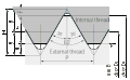
Request: Problems:
- SVG file uses arrowheads, which look fine in Inkskape but which Wikipedia currently does not seem to render correctly.
- diagram shows only the boundary line between an internal and an external thread, not the substance of the nut and bolt to which they belong (the diagram below does that better with shading).
- unify with image below
Markus Kuhn (talk) 20:17, 4 January 2008 (UTC)
Comment: to fix the arrowheads not rendering, all you need do is convert the arrow's stroke to a path (Object Menu/Stroke to Path). --Dave the Rave (DTR)talk 18:04, 9 January 2008 (UTC)
Graphist opinion:
- OK, I completely redrew the drawing from scratch. In this version the following changes were made:
- All lines aligned to the pixel grid (not millimetres, as Wikimedia does not render by the millimetre, leading to blurred lines at half and even at full resolution). In this version, H=320px (which divides by 2, 4, 5, 8, 10, 16, 20, 32, 40, 64, 80, 160), and H is then 300 px. The angle is about 61 degress, not 60, however this allows alignment to the pixel grid.
- The shading is put in to show where the metal is. It is D3D3D3 grey.
- Fractions like 3/8H is changed to 3H/* to avoid people thinking it is 3/(8H). Unlikely I know, but what is obvious to one man is not necessarily to another.
- All arrowheads are paths done by hand to avoid any problems.
- The axis is extended right along the bottom.
- What do you think? I'll do the one below now. Inductiveload (talk) 19:19, 16 January 2008 (UTC)
-
-
 New Version


Article(s): Unified Thread Standard
Request: Problems:
- GIF
- writing H1 instead of ⅝H seems unnecessary
- unify with image above
Both images are really meant to show (almost?) the same thing, and should be unified into a single common design. The only significant difference (if any) is that D and D1 are swapped between the two. ISO screw threads are named after the major (=outermost) diameter of the thread, which is called D. I don't know why the US screw thread diagrams labels the minor diameter with D, this might just be a mistake in the diagram. All other differences are just artists preference and there is no reason why these two images should look any different from each other. Markus Kuhn (talk) 20:17, 4 January 2008 (UTC)
Graphist opinion:
- I'll get these two. Inductiveload (talk) 17:25, 16 January 2008 (UTC)
- Update: Yes, these two (ISO and Unified) are identical pictures. They use the same picture here, and when you look at the figures, its exactly the same dimensions. My new plan is to use the diagram I just made above for both, and supplement it with a diagram showing how the internal and external threads can be rounded out. I will change the D's to Dmaj, Dmin and Dp for major, minor and effective pitch diameters. This will make the image impervious to variations in numbering, and can be gradually incorporated into Wikipedia's as people edit the article as the text will have to be altered. I will also reupload it under "ISO and Unified Thread Dimensions.svg" to indicate its usefulness for both kinds of thread. Inductiveload (talk) 19:41, 16 January 2008 (UTC)
- Update: Sorry changed my mind again. I've gone with the two-in-one image showing dimensions, and internal and external rounding. The rounding is less pronounced than the UTS .gif above, but I think it is about right to demonstrate the principle without needing its own dimensions. Inductiveload (talk) 20:07, 16 January 2008 (UTC)
- Excellent work, huge improvement. Thanks! Markus Kuhn (talk) 14:43, 22 January 2008 (UTC)
- Update: Sorry changed my mind again. I've gone with the two-in-one image showing dimensions, and internal and external rounding. The rounding is less pronounced than the UTS .gif above, but I think it is about right to demonstrate the principle without needing its own dimensions. Inductiveload (talk) 20:07, 16 January 2008 (UTC)
- Update: Yes, these two (ISO and Unified) are identical pictures. They use the same picture here, and when you look at the figures, its exactly the same dimensions. My new plan is to use the diagram I just made above for both, and supplement it with a diagram showing how the internal and external threads can be rounded out. I will change the D's to Dmaj, Dmin and Dp for major, minor and effective pitch diameters. This will make the image impervious to variations in numbering, and can be gradually incorporated into Wikipedia's as people edit the article as the text will have to be altered. I will also reupload it under "ISO and Unified Thread Dimensions.svg" to indicate its usefulness for both kinds of thread. Inductiveload (talk) 19:41, 16 January 2008 (UTC)
Colorado College map

Article(s): Colorado College
Request: Since we're doing the University of Oklahoma map above... the dimensions are at http://www.coloradocollege.edu/welcome/campus_map/ -- Chris (クリス) (talk) 07:16, 19 January 2008 (UTC)
Graphist opinion: Yes, we are doing U of OK, but we are not enthused. I don't mind the drawing, but labeling. . . CC doesn't look as bad for that. I did U of OK because I thought it looked bad for the lab to have things sit there for long. I should be getting my backlog of stuff cleared out. Sagredo⊙☿♀♁♂♃♄ 07:54, 19 January 2008 (UTC) COA of Nepal is moving along well. I'll start on this in a few days, unless someone else wants it. Sagredo⊙☿♀♁♂♃♄ 19:53, 26 January 2008 (UTC)
- If you don't want to do this, maybe send it over to the Greenspun project? I hear they have quite the dilemma - lots of money to spend on images but nothing to draw. -- I. Pankonin (t·c) 06:42, 31 January 2008 (UTC)
- Great start, (1) it is Uintah, however. :) Chris (クリス • フィッチ) (talk) 16:24, 5 February 2008 (UTC)
- ps and (2) Cache La Poudre :) Chris (クリス • フィッチ) (talk) 07:13, 7 February 2008 (UTC)
(1) You should expect me not to get Uintah
(2) Pardon my French!
- But of course, the French being the most modest and self-deprecating of nations... That's why the kings are all named Louis, it's easy to spell... :) Chris (クリス • フィッチ) (talk) 02:11, 8 February 2008 (UTC)
The boundaries were hard to determine, do they look Ok to you?
I have that feeling that I've missed something. Sagredo⊙☿♀♁♂♃♄ 02:07, 8 February 2008 (UTC)
- Nope, perfect, thank you so much! Marking as done! Chris (クリス • フィッチ) (talk) 22:35, 9 February 2008 (UTC)
Tooth of Time


Article(s): Boy Scouts of America
Request: lighten for detail -- Chris (クリス) (talk) 06:17, 23 January 2008 (UTC)
Graphist opinion: Adjusting Brightness/contrast to see the mountain results in a washed out sky. Which can be fixed, although a close examination of the skyline might reveal some flaws. Most of which disappeared with downsampling (3000px to 1500). Sagredo⊙☿♀♁♂♃♄ 21:55, 23 January 2008 (UTC)
- Not getting any feedback from the Scouting project, kind of want to mark this stale. Chris (クリス • フィッチ) (talk) 02:00, 8 February 2008 (UTC)
- Is there any way (yes, you've already parted the Red Sea for me, maybe this time gargle peanut butter) that you could use the contrast of the middle image but put the original natural sky back in? Chris (クリス • フィッチ) (talk) 04:58, 8 February 2008 (UTC)
Beautiful! 4 it is! Please overwrite original, and many thanks! We can be done with this one! Chris (クリス • フィッチ) (talk) 15:28, 8 February 2008 (UTC)
Ian Smith
-
 Ian Smith

Article(s): Ian Smith
Request: Would it be possible to separate the image from the signature and then to create a SVG version of the signature as done with the Mugabe signature? Mangwanani (talk) 18:56, 29 January 2008 (UTC)
Graphist opinion: Do you know about copyright in signatures ? I was thinking about nominating the one for Mugabe for deletion, but decided against, as it seemed a bit unkind, just after someone had gone to the effort of vectorising it. I don't know about any special dispositions for copyright on signatures, I'm thinking they are probably copyrighted, but I might be mistaken, unless you know for sure, maybe a little research or a question at WP:COPYRIGHT would be in order, before putting effort into something which might be deleted. Also I see the image is fair-use so making a vector version would not be allowed. (can't make derivatives of copyrighted material) Jackaranga (talk) 19:17, 29 January 2008 (UTC)
- If you know more about this let us know please, else we may have to look into it further. Jackaranga (talk) 19:17, 29 January 2008 (UTC)
- To be honest, I hadn't thought of that. But the message I got across from Commons was that if you make something then the copyright is yours even if it is entirely an image created by someone else, eg. flags. So if someone created an SVG version of the signature they could claim copyright for it in the same way as flags surely? Thats my current view right or not. Mangwanani (talk) 19:23, 29 January 2008 (UTC)
- But if that's your logic, you could take a photo copyrighted art (to which the producer of the art has copyright), vectorise it and then hold that the vectorised version is free from the original copyright, but that can't be the case. This is a case for the copyright reference desk. --Seans Potato Business 22:34, 29 January 2008 (UTC)
- To be honest, I hadn't thought of that. But the message I got across from Commons was that if you make something then the copyright is yours even if it is entirely an image created by someone else, eg. flags. So if someone created an SVG version of the signature they could claim copyright for it in the same way as flags surely? Thats my current view right or not. Mangwanani (talk) 19:23, 29 January 2008 (UTC)
- I think Sean is probably right for wikipedia, however on the commons I'm thinking it may be accepted as Image:Signature of Robert Mugabe.jpg seems not to be copyrighted, perhaps this one isn't either. Jackaranga (talk) 22:52, 29 January 2008 (UTC)
- Assuming that the uploader of the image was correct in stating that it is not copyrighted. Signature#Copyright says that it's not possible to copyright signatures in the US but I don't know about other countries. --Seans Potato Business 23:25, 29 January 2008 (UTC)
- Ah good, that's exactly the kind of exception I thought might of existed, but I wasn't sure, so I'm guessing it's fine to extract that signature, vectorise it, and upload it as PD ineligible then. Jackaranga (talk) 00:09, 30 January 2008 (UTC)
- Actually, I'm not sure. While a signature itself cannot be copyrighted, this particular signature forms part of a copyrighted poster and since you would be deriving your SVG from a copyrighted material, that might not be allowed. If the signature was available somewhere else, on its own, then that clearly would be okay, but it's unclear in this case. I suggest taking it to the copyright reference desk. --Seans Potato Business 00:52, 30 January 2008 (UTC)
- As signatures are not eligible for copyright, placing one in a poster does not give the publisher a copyright to the signature. It can be used. (Using the U. S. law) Signatures are put in the catagory of simple objects like circles or stars. I have in the past been involved in publishing postcards, and have seen product we order from one printing firm arrive with (c) printing company. Not (c) Sagredo. This was on postcards using photos I had personally taken. We sent them a fairly angry letter (and no more orders.) Copyright symbols can be put anywhere, they're not always valid.
- The wiki rules about cropping from fair use images use this analogy. If a painting of roses is used in the article of the author as a example of the author's style, that's fair use. But we are not allowed to crop out a rose to illustrate the article on roses. Unless we come up with someone willing to research Zimbabwean copyright law, I would go by the U. S. law and assume that this signature is the equivalent of a circle or star. We can do with it as we want. If someone wants to claim it violates Zimbabwean law, let them bear the burden of proof, and they can go do the research. Sagredo⊙☿♀♁♂♃♄ 03:40, 30 January 2008 (UTC)
- Analogy. If a book contained a phrase from the U. S. Constitution, and the book was copyrighted, the owner of the copy would not suddenly have gained a copyright to that part of the constitution. Only the remaining part of the book would be covered by the copyright. Sagredo⊙☿♀♁♂♃♄ 03:44, 30 January 2008 (UTC)
- To be fair, Zimbabwe doesn't really have any laws let alone copyright laws of a signature of a person that the current president would probably describe in a mega-negative way. I should know, I come from there and have met good old Uncle Bob himself. Mangwanani (talk) 18:57, 30 January 2008 (UTC)
- Actually, I'm not sure. While a signature itself cannot be copyrighted, this particular signature forms part of a copyrighted poster and since you would be deriving your SVG from a copyrighted material, that might not be allowed. If the signature was available somewhere else, on its own, then that clearly would be okay, but it's unclear in this case. I suggest taking it to the copyright reference desk. --Seans Potato Business 00:52, 30 January 2008 (UTC)
I think we're done, at least with the image, the debate will probably never end. Sagredo⊙☿♀♁♂♃♄ 02:29, 8 February 2008 (UTC)
ASA logo
Articel: As linked in the image above
Request: Trim the space around the logo (There's alot of transparent buffering). Also, this looks easy to SVG, but it's not a widely used logo, so I'm hesitant to request it; does anyone thing it would be useful to do so? 68.39.174.238 (talk) 00:12, 2 February 2008 (UTC)
Graphist opinion: It would be useful to know what font is used... Anyway, what do you think? --escondites 17:08, 2 February 2008 (UTC)
- The original font looks exactly like Arial/Helvetica to me. Stannered (talk) 18:01, 2 February 2008 (UTC)
- I hate to say it, but the difference in fonts is obvious: The original "S" is much more curved, and the color appears much blacker. Can you try and trace the letters? Thanx... 68.39.174.238 (talk) 23:09, 2 February 2008 (UTC)
- And this is why I don't do more image work on wikipedia. The SVG's that are acceptable here do not support font embedding, so the only solution is to trace outlines, which I'm pretty sure violates font copyright laws in the US (raster is ok, but vector outlines is not). The next thing that comes to mind is that isn't not a good idea to make an SVG out of a non-free image? Seems to go against WP:FUC #3(b).-Andrew c [talk] 04:43, 3 February 2008 (UTC)
- "The U.S. Copyright Office holds that a bitmapped font is nothing more than a computerized representation of a typeface, and as such is not copyrightable." [6] The above typeface raster is not protected. Only the "font output program" is protected. Sagredo⊙☿♀♁♂♃♄ 07:08, 3 February 2008 (UTC)
- And, oh, should you figure out that this is a logo or trademark, it's still free. [7] as nothing in it is copyrightable. [[8]]Sagredo⊙☿♀♁♂♃♄ 08:43, 3 February 2008 (UTC)
- And this is why I don't do more image work on wikipedia. The SVG's that are acceptable here do not support font embedding, so the only solution is to trace outlines, which I'm pretty sure violates font copyright laws in the US (raster is ok, but vector outlines is not). The next thing that comes to mind is that isn't not a good idea to make an SVG out of a non-free image? Seems to go against WP:FUC #3(b).-Andrew c [talk] 04:43, 3 February 2008 (UTC)
- It's been a while since I last discussed this, but I believe we discovered that encoding the outlines of a font via SVG constitutes a "font output program" which is why there was a movement to make all new Category:Typeface samples png, and to convert the old (which was never completed). If you want, I can try to dig up the conversations which led me to this belief. I could be mistaken. And this issue may be different here because it is just 2 letters, not a whole alphabet.-Andrew c [talk] 15:39, 6 February 2008 (UTC)
- Surely you could just output a PNG at stupidly high resolution and then auto-trace it (which will almost invariably produce identical or indistinguishable output from simply rendering the font). The difference with a "font output program" (font file?) is that it includes hinting information that you don't get in any raster/bitmapped version; this information is NOT translated into the SVG. Stannered (talk) 16:07, 6 February 2008 (UTC)
- Once rasterized it is PD. Period. At any resolution. If a trace to an SVG results in a "font output program," that would be a new "font output program," very different from the original "font output program", and not a violation of the original programs copyright. Once things are PD, they don't go back to being eligible for copyright. "font output program" was the government's term, and I'm sure does refer to the font file. Sagredo⊙☿♀♁♂♃♄ 20:27, 7 February 2008 (UTC)
- Surely you could just output a PNG at stupidly high resolution and then auto-trace it (which will almost invariably produce identical or indistinguishable output from simply rendering the font). The difference with a "font output program" (font file?) is that it includes hinting information that you don't get in any raster/bitmapped version; this information is NOT translated into the SVG. Stannered (talk) 16:07, 6 February 2008 (UTC)
YWCA

Article(s): YWCA
Request: clean up aging, brighten, perhaps graphically mask out the adhesive holder at the top, trim out, in short, do do that voodoo that you do so well (apologies to Cole Porter) -- Chris (クリス • フィッチ) (talk) 04:33, 2 February 2008 (UTC)
Graphist opinion: Here's my humble attempt. --escondites 16:58, 2 February 2008 (UTC)
- That is beautiful, thank you! May I ask a favor? Would you try one other version, with the full background, just not the white edge? It will show it as being a poster, then we can decide which image would be nicer for the article. Again thank you so much! Chris (クリス • フィッチ) (talk) 18:06, 2 February 2008 (UTC)
- Like this? --escondites 18:30, 2 February 2008 (UTC)
- The cache has not yet purged for me, I will let you know soon. :) Chris (クリス • フィッチ) (talk) 04:13, 3 February 2008 (UTC)
- Beautiful, would you please overwrite the existing image to preserve the image history? Thank you! :) Chris (クリス • フィッチ) (talk) 16:26, 4 February 2008 (UTC)
- Done! --escondites 17:21, 4 February 2008 (UTC)
- Thank you so much! Chris (クリス • フィッチ) (talk) 22:02, 4 February 2008 (UTC)
A very blatant SVG
-
 The image in question
 -

-

-


Articels: {{US-company-stub}}
Request: SVGify, using the two stated sources, and maybe remove the whitespace around the edges. 68.39.174.238 (talk) 23:18, 2 February 2008 (UTC)
Oppinion: I've got a couple of ideas I'd like to try. 1 Reversing the icon right to left, so the smoke and flag both indicate the same wind direction. 2 raising up the smoke so it does not go in front of the flag. (Or will this mess up a whole set of icons?) Sagredo⊙☿♀♁♂♃♄ 05:58, 3 February 2008 (UTC)
- I don't think anyone will complain, especially since it is more compact. If not, I'll let you know and/or try and argue the point with them. Thanx, 68.39.174.238 (talk) 16:17, 3 February 2008 (UTC)
Prosthaphaeretic slide rule
-
 illustration of prosthaphaeretic slide rule
 -


Article(s): http://en.wikipedia.org/wiki/Prosthaphaeresis
Request: I am no artist and this is my first attempt at a vector image. A more polished and perhaps more realistic replacement may be needed. To make it more realistic, I think the sliding attachment point for the second string (black oval) should instead be represented by a sliding attachment like the cursor on a traditional slide rule, and the bars should have a more detailed (and readable) set of scales. --IPiAweKid (talk) 06:26, 4 February 2008 (UTC)
Graphist opinion: Interesting concept. It is mathematically sound. It ought to have spirit level as it would be essential to keep the lower bar level. I suspect that such a device would never approach the 0.2% accuracy that was expected from the traditional slide rule. It of course, still lacks the trig, log, and exponential functions of the good ol' slipstick. Sagredo⊙☿♀♁♂♃♄ 06:28, 5 February 2008 (UTC)
- Thank you. Very slick illustration. I agree with your assessment about the level. Right angle attachments instead of strings would be very inelegant by comparison. As for accuracy, Sher and Nataro in their paper seemed to be more interested in playing with an interesting invention that technology apparently had skipped over on the way to the logarithmic slide rule.
Seal of Mauretania
Article(s):Many. See image page.
Request:Vectorize. Please and thanks. -- escondites 17:29, 5 February 2008 (UTC)
Graphist opinion: Here's my effort at it. If you can find a bigger/better raster version I could add more detail to the tree and vegetation. Will this work? Jeff Dahl (Talk • contribs) 09:07, 6 February 2008 (UTC)
- Thanks! It looks great! But I didn't find any larger version... Anyway this one is (from now on) the larger version :-) --escondites 18:02, 6 February 2008 (UTC)
Eskom
-
Eskom logo
Article(s): Eskom
Request: SVG logo. Thanks Mangwanani (talk) 13:17, 6 February 2008 (UTC)
Graphist opinion: EPS is available here. Stannered (talk) 13:41, 6 February 2008 (UTC)
- Here's my attempt at it, however, it doesn't generate a thumbnail... wierd. --escondites 10:09, 7 February 2008 (UTC)
- Saved it as "Plain SVG" in Inkscape, and that did the trick. -- I. Pankonin (t·c) 11:17, 7 February 2008 (UTC)
Twin Rivers logo
-
Twin Rivers Logo Easy?
Article(s): Twin Rivers Primary School
Request: More SVGery. Thanks Mangwanani (talk) 15:37, 6 February 2008 (UTC)
Graphist opinion: I'll do this one. -- I. Pankonin (t·c) 07:18, 7 February 2008 (UTC)
Is there a URL for the source of this image? I'm hesitant to upload a logo without a source. -- I. Pankonin (t·c) 07:53, 7 February 2008 (UTC)
- Basically, my school report. Mangwanani (talk) 16:29, 7 February 2008 (UTC)
NC-17
-
NC-17 rating image
-
 SVG version
Article(s): Motion Picture Association of America film rating system
Request: Can someone create an SVG version of this? Should take about 5 seconds for someone with the font ITC Stone Informal Bold. Thanks! -- Stannered (talk) 00:42, 9 February 2008 (UTC)
Graphist opinion:
White House radio broadcast 1937

Article(s): Walter W. Head
Request: brighten and contrast -- Chris (クリス • フィッチ) (talk) 05:23, 7 February 2008 (UTC)
Graphist opinion: Ok, I did the best I could. I didn't lighten it too much, cause then all the artifacts and grainy details come out. I did try to make it look better, but a better source is definately needed. Btw, please check the copyright details on the pic, I'm not sure I put the right one in. XcepticZP (talk) 15:46, 7 February 2008 (UTC)
- That's great, just right, thanks! Chris (クリス • フィッチ) (talk) 16:03, 7 February 2008 (UTC)
Emblem of the Arab League
-
Emblem of the Arab League
-
 SVG emblem

Article(s):Arab League
Request:Can this be vectorized, perhaps by modifying the slightly different version that can be obtained at the flag of the Arab League? TIA. -- escondites 18:26, 7 February 2008 (UTC)
Graphist opinion: Here it is. I also re-did the Arabic text on the flag and both images now have 22 links in the chain that symbolize the current 22 member states. Jeff Dahl (Talk • contribs) 22:42, 7 February 2008 (UTC)
- Thanks! But what about the red circle in the seal? --escondites 09:49, 8 February 2008 (UTC)
- I couldn't figure out what was supposed to be inside the small red oval at the bottom, and a web search shows a fair amount of variation in the elements used in the emblem and flag, so I decided to skip it. If you can show me what's supposed to be in there I'd be happy to add it. Jeff Dahl (Talk • contribs) 16:48, 8 February 2008 (UTC)
- Hmm, perhaps it's not necessary, as this page from the Arab league website doesn't show it, so I'll add this one to the article. Thanks again for the image :-) --escondites 19:13, 8 February 2008 (UTC)
- I couldn't figure out what was supposed to be inside the small red oval at the bottom, and a web search shows a fair amount of variation in the elements used in the emblem and flag, so I decided to skip it. If you can show me what's supposed to be in there I'd be happy to add it. Jeff Dahl (Talk • contribs) 16:48, 8 February 2008 (UTC)
Coat of arms of Rome
Articels: Rome, among others
Request: SVGification, please :-) --escondites 21:17, 7 February 2008 (UTC)
Oppinion: I left a message on the author's talk page, because I don't think anything I could make would measure up. I've disassembled one of his images before. He's very talented. As an aside, it has the wrong copyright. He would be entitled to release this himself. -- I. Pankonin (t·c) 05:22, 8 February 2008 (UTC)
- Could we use this? I know that a layer of the crown is pushed slightly to the left, and that one of the 'dots' in the crown is missing. - Some of the misterious errors between Inkscape and Wikipedia's rendering of SVGs..- 19:35, 8 February 2008 (UTC)


- Yes, thanks! --escondites 19:47, 8 February 2008 (UTC)
- It's the blur filter that does it; Wikimedia consistently misrenders blurred objects above and to the left of where they should appear, particularly in scaled-down images. Stannered (talk) 00:45, 9 February 2008 (UTC)
Placeholder Images
Original:
-
 Male portrait
 -
 Female portrait
 -
 Neutral portrait
 -
 Building photo


.svg)
First attempt:
-
 Male portrait
 -
 Female portrait
 -
 Neutral portrait
 -
 Building photo
.svg)
.svg)


Addressing some concerns:
-
 Male portrait
 -
 Female portrait
 -
 Neutral portrait
_test.svg)
_test.svg)

Another scheme:
.svg)
.svg)
.svg)
Also see Category:Wikipedia image placeholders and 
Article(s): All articles that have missing images - used by themselves, used in infoboxes, and other templates
Request: Most people liked the newer versions, but disliked certain aspects, especially the blue. You graphics people should be able to make them a lot better, though. See Wikipedia:Village_pump_(proposals)#Redesign_of_placeholder_images for previous discussion, including rationale. — Omegatron 13:46, 3 September 2007 (UTC)
Graphist opinion: A few specifics of what you would like done would be really helpful at generating interest. —Cronholm144 08:09, 10 September 2007 (UTC)
- Make them look better? There are many details discussed in the link to the Village Pump. — Omegatron 04:04, 12 September 2007 (UTC)
- Comment: I think you'd be best keeping the discussion in one place, rather than on two different pages. Also, I really don't like the most recent images under the title "Another scheme". "Addressing some concerns:" looks better, the designs are more consistent and look smoother. --Dave the Rave (DTR)talk 15:02, 12 September 2007 (UTC)
- I agree. They are less readable and less professional than even the original ones. I believe the best way to go would be a grayscale SVG theme for every category, including the "missing cover" images, in the style of "Addressing some concerns". vlad§inger tlk 22:54, 13 September 2007 (UTC)
- I've asked for some feedback on what should be done at Wikipedia:Village_pump_(proposals)#Redesign_of_placeholder_images. It would nice to have every placeholder image on Wikipedia in the same style (consistancey + standardisaton = good, at least, in my mind), but I realise this is probably impossible. --Dave the Rave (DTR)talk 17:35, 14 September 2007 (UTC)
- I agree. They are less readable and less professional than even the original ones. I believe the best way to go would be a grayscale SVG theme for every category, including the "missing cover" images, in the style of "Addressing some concerns". vlad§inger tlk 22:54, 13 September 2007 (UTC)
- I'm not sure I like the inconsistancy between the man and woman in the last set - the man gets head and shoulders, the woman down to her waist, and her pose is a lot less formal. Adam Cuerden talk 22:31, 15 September 2007 (UTC)
- Hmm. It also makes assumptions as to the generic woman's age that may, in all likelihood, not be true - imagine that cutout in, say, Queen Elizabeth II. For that matter, the American skyscraper skyline cutouts are probably not very appropriate for historical buildings, which could also cause cognitive dissonance Adam Cuerden talk 22:35, 15 September 2007 (UTC)
- I'm not sure I like the inconsistancy between the man and woman in the last set - the man gets head and shoulders, the woman down to her waist, and her pose is a lot less formal. Adam Cuerden talk 22:31, 15 September 2007 (UTC)
What about Image:No Photo Available.svg with the outline of a battleship in the background? (It's almost solely used for old Federal/DANFS ships, so you aren't likely to have much trouble there. 68.39.174.238 02:06, 16 September 2007 (UTC)
I posted this on the Village pump on this topic: I'd like to see the request be small, italic, and bracketed. I came here from WP talk: Avoid self-references; my issue with the proposals is that they mix content and Wikipedia "meta-content" without enough clarity. Most of the meta-content in Wikipedia is italic, including disambiguations, citation needed, and stub notices. (The only meta-content not in italics are framed things like NPOV.) How about either (1) change "Click here to upload one" to smaller text in the top right that says [upload a picture] or (2) get rid of the silhouette and go with a frame that looks more like the NPOV, perhaps with the text "No free image exists. You can help Wikipedia by providing one."? Consider these two versions, which make an effort to be clear about what is meta-content:


I think these are less like "...where he died in 1862. Have more information? Click here to edit the article." and more like "...where he died in 1862.[day of death needed]" —Ben FrantzDale 14:31, 18 September 2007 (UTC)
Placeholder suggestion for CD
-
 attempt

Article(s): see above.
Request: I had a go at making an image like Image:Nocover-upload.png in the style of Image:No male portrait.svg for a 'there is no CD picture' thing. I'd like to know what people think, and if anybody still cares about these placeholder images. --Dave the Rave (DTR)talk 17:26, 20 September 2007 (UTC)
Here's what it would look like in an article.
| "Graphics Lab/Images to improve/Archive/Feb 2008" | |
|---|---|
| Song | |
| B-side | "Foo, Bar... and Baz" |
Opinion(s):
- Eh, nice, except that you're unlikely to be able to obtain a free image of a CD cover. Unless it's a free CD, I suppose... —Ilmari Karonen (talk) 17:40, 20 September 2007 (UTC)
- Any suggestions for wording? 'No Cover Available' is on the original image. --Dave the Rave (DTR)talk 19:00, 20 September 2007 (UTC)
- Yeah, nearly all album covers are not free. Besides, what's wrong with the current image? - Rocket000 21:54, 27 September 2007 (UTC)
- I think the SVG version is indeed nicer. But yes, "no cover available" would be a better text. —Ilmari Karonen (talk) 00:08, 28 September 2007 (UTC)
- Text is changed. --Dave the Rave (DTR)talk 15:56, 28 September 2007 (UTC)
- I think the SVG version is indeed nicer. But yes, "no cover available" would be a better text. —Ilmari Karonen (talk) 00:08, 28 September 2007 (UTC)
- That "Click here to upload" text... Will the user actually get to an appropriate upload page by clicking the image when it is correctly used? --Slashme 09:18, 15 October 2007 (UTC)
- it would be possible yes.Genisock2 03:18, 18 October 2007 (UTC)
I like this one. Can you make versions of the others in a similar style? — Omegatron 04:08, 13 October 2007 (UTC)
- I'm more than happy to, any suggestions for specific placeholders? --Dave the Rave (DTR)talk 12:38, 14 October 2007 (UTC)
- I meant for all of them, including the people. :-) At least the wording and colors. — Omegatron 02:27, 26 October 2007 (UTC)
- Errr.. I based the CD on the people themselves.... --Dave the Rave (DTR)talk 18:35, 27 October 2007 (UTC)
- I meant for all of them, including the people. :-) At least the wording and colors. — Omegatron 02:27, 26 October 2007 (UTC)
- Above includes suggestions for Battleships and for buildings... --Dave the Rave (DTR)talk 16:16, 14 October 2007 (UTC)
- Going by Image:Replace this image.svg towns, cameras and airports.Geni 12:46, 15 October 2007 (UTC)
- Above includes suggestions for Battleships and for buildings... --Dave the Rave (DTR)talk 16:16, 14 October 2007 (UTC)
Map service icons
-

 Map
Map
(to be improved) -

 Satellite
-

 Hybrid
(?) -

 Hybrid Attempt
 -
 Blacklemon67's Satellite idea
 -

 Blacklemon67's Map idea
 -

 Blacklemon67's Hybrid idea
 -

 Blacklemon67 - SVG Map
 -

 Blacklemon67 - SVG Satellite
 -

 Blacklemon67 - SVG Hybrid
 -

 Combined Gnome regular and Blacklemon67 map


Article(s): Template:GeoTemplate / Template:GeoTemplate/sandbox / Template:GeoTemplate/sandbox/main.css
Request: There's been some work recently to improve the coordinate service list Wikipedia links to, and one of the proposals uses icons to signify the type of service (see example). They're perhaps understandable-ish in the proposed context, but at least the map icon needs improvement. Could someone draw or place something on it so that it looks like a map, while being different enough from the satellite icon but still keeping the same style? The hybrid one might need modification accordingly. --Para 14:59, 19 October 2007 (UTC)
- Suggestion: A North Arrow on the map icon maybe? --Dave the Rave (DTR)talk 17:54, 24 October 2007 (UTC)
Graphist opinion: I had a quick go at the hybrid because I'm going on holiday for 5 days from tomorrow. Oh and for anyone who wants to continue this, the SVG's of this theme are available here (And the palette for the theme is included in it, might be useful) . > Rugby471 talk ⚔ 18:00, 19 October 2007 (UTC)
What about using this for the satellite: ![]() Rocket000 05:14, 27 October 2007 (UTC)
Rocket000 05:14, 27 October 2007 (UTC)
- Looks good. The map icon is still missing though. My idea for the hybrid was to simply put the map and satellite icons together, but we'd need a descriptive map icon first. --Para 19:50, 10 November 2007 (UTC)
- The map could have lines to show roads...
Blacklemon67: Why so much perspective distortion? I think it makes it harder to recognize. And perhaps the white street lines on the hybrid should be thicker so there' more visual difference to the sattelite icon. -- Ddxc 11:39, 1 December 2007 (UTC)
- Ok, made a new scheme in inkscape, so they're svg-s. I hope this one works!
- The second set is better and they're fine in thumbnail size, but in icon size they look so much alike. I combined the blank icon with Blacklemon67's map, but it still looks a bit pale. I guess the Gartoon style of the first icons is to use strong lines and colours? May be difficult to make them different enough, if at some points someone feels an icon for topographic maps is necessary. --Para (talk) 16:15, 9 January 2008 (UTC)
- Ok, we'll use that. The hybrid could be the planet right next to the map.
- The second set is better and they're fine in thumbnail size, but in icon size they look so much alike. I combined the blank icon with Blacklemon67's map, but it still looks a bit pale. I guess the Gartoon style of the first icons is to use strong lines and colours? May be difficult to make them different enough, if at some points someone feels an icon for topographic maps is necessary. --Para (talk) 16:15, 9 January 2008 (UTC)
- Ok, made a new scheme in inkscape, so they're svg-s. I hope this one works!
Carletoncollegeseal
-
160 px wide
Article(s):Carleton College
Request: Please create an SVG version of this file. -- Kushalt 15:47, 11 December 2007 (UTC)
Graphist opinion: I don't think it needs to be, it is already at a fairly high res and good enough quality. > Rugby471 talk ⚔ 17:35, 11 December 2007 (UTC)
- The fair use nazis would probably delete an SVG. ¦ Reisio (talk) 07:23, 16 December 2007 (UTC)
- i need to know what the tiny text in the books say --72.89.193.84 (talk) 15:54, 29 December 2007 (UTC)
- The floating book says AI AGIAI GRAFAI; the bottom book says TO KALON KAI TO AGATHON. this is taken from Carleton College's Seal webpage --Ordoon (talk) 21:49, 29 December 2007 (UTC)
"Ref" button on edit toolbar
![]()
![]()
![]()
![]()
![]()
![]()
Article(s): edit toolbar (not an article, part of site interface)
Request: We have recently added a button for producing "ref" tags to the edit toolbar — see Wikipedia:Village pump (proposals)#Put button for "ref" tags in edit window toolbar. There were several icons already available for this purpose (see above), and the person who implemented it used the button on the second-to-right. However, it might be better to have a more intuitive icon, whose purpose would be more obvious to newbies. Any ideas on design? Thanks.-- Pharos (talk) 21:29, 13 December 2007 (UTC)
- Is the request possible? I can't imaging a graphic that is universally obvious to everyone as meaning "reference" the way, say, the "I" is obviously italics. Also, note that the toolbar icons have tooltips, so it's not a total loss. 68.39.174.238 (talk) 20:05, 23 January 2008 (UTC)
Graphist opinion:
You could depict a footnote, the result of a ref, with the number standing out: '…ere2.' ¦ Reisio (talk) 07:28, 16 December 2007 (UTC)
To avoid the button looking like a superscript button, have the text be something like "ref2" --BsayUSD [Talk]π[contribs] 21:12, 17 December 2007 (UTC)
Wikimedia-servers

Article(s):http://meta.wikimedia.org/wiki/Wikimedia_servers
Request: We should have each year a new version which is uptodate. Thanks. -- Kolossos (talk) 19:16, 20 December 2007 (UTC)
- At the very least, can some of the more egregious errors be corrected? Didn't the Korean svrs get trashed a few years ago? 68.39.174.238 (talk) 20:03, 20 December 2007 (UTC)
Graphist opinion: This would probably a fairly easy project if some one would clearly state the changes that are needed. 1. What needs to be removed. 2. What needs to be added. Sagredo⊙☿♀♁♂♃♄ 18:17, 30 December 2007 (UTC)
- This infos are here, but I can't make head or tail of some of the notations... Also, the heading at the top of the page does not make me feel like trusting it. 68.39.174.238 (talk) 22:24, 1 January 2008 (UTC)
- What would make this simple would be if Kolossus could supply us with a simple list of how many machines are each group in the diagram above, and if any of the links need to be changed. It helps if you just presume we're stupid, which, for me, some days. is pretty much the truth. Sagredo⊙☿♀♁♂♃♄ 18:31, 12 January 2008 (UTC)
- Unfortunately I'm not sure that that can be easily discovered; all the documentation seems to be opaque or splattered with warnings that its out of date and not trustworthy. 68.39.174.238 (talk) 13:06, 13 January 2008 (UTC)
I hate to say it, but this one looks trashworthy. This will probably end up being the 1st in out (nonexistent) page of "We wont do these..." since the data to create the graph appears to be not discoverable or non decipherable. 68.39.174.238 (talk) 19:08, 28 January 2008 (UTC)
Overlap extension PCR - molecular biology technique
![]() ----Seans Potato Business 11:31, 30 January 2008 (UTC)
----Seans Potato Business 11:31, 30 January 2008 (UTC)

Article(s): OE-PCR
Request: This is an unusual request, in that I actually want to do the work myself. I created the above image a long time ago without the intention of using it on Wikipedia, but rather to explain to a single person what OE-PCR is. I'm trying to learn to create my own graphics (particularly interested in molecular biology illustrations) and this image should be a good, simple project to start with. The only things being displayed in the above image are arrows and DNA strands. Would Inkscape be my best option? I've seen nice work with Creature House Expression. I would like to show individual base-pairs so I can emphasise the mis-matches and ideally, I'll be able to tweak the proximity of the strands, as if they were paths in Inkscape.
I would like my base-pairs to look like these:


I would like the base-pairs to have the letter sequence inside each base as in the first example.
--Seans Potato Business 03:17, 28 December 2007 (UTC)
Graphist opinion: As far as software goes, Inkscape is what's usually used for wikipedia, probably because it's free and uses SVG as its native format, so you don't have to convert any of the files. AFAIK, creature house isn't free and has the same kind of features so unless you've already got a copy you're probably better off going for inkscape. Time3000 (talk) 17:05, 28 December 2007 (UTC)
- Welcome! I'm sure we'll be able to sucker you into joining the graphics lab in short order ;-)
- If you work in inkscape, you'll get very good support from the other Graphics Lab members, as many of them use it.
- Go ahead, make your diagram, and upload it. Then ask for suggestions and improvements; I'm sure you'll get lots of help and advice (some of it from friendly people, even.) If you remind people to explain their processes, you can learn a lot very quickly.
--Slashme (talk) 14:07, 29 December 2007 (UTC)
Oh, by the way, you'll be drawing arrows, so let me fill you in on the first inkscape vs wikipedia gotcha that you will hit: The arrowheads that inkscape makes are not supported in wikipedia, so you have to convert your arrowheads to paths. Also, I've found that saving a file as "plain svg" helps not only to make the file smaller, but generates output that is more likely to be compatible. --Slashme (talk) 14:11, 29 December 2007 (UTC)
- Thanks for the nice replies :)
- Is there some way that I can link objects to a path so that I can change the path and have the objects follow it? I've made an SVG to demonstrate what I mean (in this example, I had to move the objects manually to match the path). This would be a very tedious method for my actual intention which is to be able to bend the DNA strands around (in the SVGs above, all the components are completely unconnected). --Seans Potato Business 20:32, 29 December 2007 (UTC)
http://www.petaimg.com/uploads/1198962735.svg
- As far as I know, there's no way to do exactly that for objects - you can do it for text with Text -> Put on Path but that's probably not very helpful. The next closest things I can think of are the "Align and Distribute" and "Grid Arrange" options at the bottom of the Object menu. Not sure if that's any help, but let me know if you do find what you were looking for. Time3000 (talk) 18:13, 31 December 2007 (UTC)
- I think it's something we might get in 0.46 - they're calling them "markers"? Don't know if it'd actually be of any use for what I'm trying to do. When is 0.46 due? --Seans Potato Business 22:25, 31 December 2007 (UTC)
- Aligning objects along a Bezier curve is a sort of work around but changing the path wont change the flow of the pattern based up on it. --Seans Potato Business 02:05, 7 January 2008 (UTC)
Actually I think this is done, as it was a request for information rather than a request for an image. If we can Sean back to his Potato Business to mark it done. Sagredo⊙☿♀♁♂♃♄ 01:21, 29 January 2008 (UTC)
Poliomyelitis map
-

-
 PNG version
 -
 Massive SVG


Article(s): Poliomyelitis_eradication
Request: i think jpg is not the best format for a map. -- → Pepper / ? 18:33, 6 January 2008 (UTC) (Note, actual user User:PepperIT)
Graphist opinion: I personally think an SVG version of this map would be much too large (over 1.5 MB), but I've uploaded one anyway. From the vector version (quite easy to make from Image:BlankMap-World6, compact.svg), I've also generated a PNG, which I recommend be used in the article. I also took the liberty of updating the map with data from the Global Polio Eradication Initiative, since the original JPG didn't mention a source; the map should now match the table over at Poliomyelitis eradication—or the table needs to be updated :) Best, Fvasconcellos (t·c) 23:38, 7 January 2008 (UTC)
This appears to be done, the png is up at the article. 71.221.13.130 (talk) 06:50, 29 January 2008 (UTC)
- Someone asked the original requester to check and see if it is done correctly; we'll see what they say. 68.39.174.238 (talk) 21:58, 8 February 2008 (UTC)
Life Expectancy Graph from WRI data
![]() Done
Done


Article(s):
Request: Is currently a PNG, lines are heavily aliased. Could someone heavily versed in gnuplot or similar make this into an SVG, with the latest data and with nice pretty lines and without Times New Roman? :D Thanks. —Vanderdecken∴ ∫ξφ 10:00, 14 January 2008 (UTC)
Graphist opinion: I can do this quite easily: this afternoon when I get home I'll check whether the request is still open, and if no-one has beat me to it, I'll sort it out. --Slashme (talk) 10:13, 14 January 2008 (UTC)
Hmm, had to replace this request as it got deleted by accident some time today. I'll have a look at it in a few hours. --Slashme (talk) 18:48, 14 January 2008 (UTC)
OK, due to power brownouts, an early morning tomorrow and a wife who insists that we go to bed :-| I am only uploading an incomplete job. The source data and gnuplot script are in the svg file at the end. --Slashme (talk) 20:34, 14 January 2008 (UTC)
I have now removed the titles from the graph itself to make it easier to re-use the chart on other language articles, and put it into the image description page in a form that can be cut and pasted into a caption. I have also corrected the x-axis numbers (I had them as single years to make the plotting easier, but now they are ranges.) Let me know what you would still like to see. --Slashme (talk) 06:40, 15 January 2008 (UTC)
- Massive improvement. Unless it's against some guideline or other, could we have the y scale going up to 90 but only starting at 20 or 30? The actual data seems to be squashed up at the top which is a bit of a waste of vectorised space. One problem - if I zoom into the graph using IE (god forbid I should have to touch that program, but in the interests of compatibility...) the text becomes pixelated as if it were a bitmap - is there an explanation for this? —Vanderdecken∴ ∫ξφ 18:37, 25 January 2008 (UTC)
- Complete?↔NMajdan•talk 14:26, 30 January 2008 (UTC)
- It's not like Slashme to leave something undone for so long. (Hope he's Ok. - probably just too tired after those "brownouts!") I'm a poor stand in for him on this, but I think this is what you want. On this page it is rendered into a png by Wiki, and you might see pixels. You don't actually get the svg until here I increased the svg document size, that should help. Sagredo⊙☿♀♁♂♃♄ 05:22, 31 January 2008 (UTC)
- My pixelation comment was about this version - the text isn't smooth. —Vanderdecken∴ ∫ξφ 11:03, 10 February 2008 (UTC)
- It's not like Slashme to leave something undone for so long. (Hope he's Ok. - probably just too tired after those "brownouts!") I'm a poor stand in for him on this, but I think this is what you want. On this page it is rendered into a png by Wiki, and you might see pixels. You don't actually get the svg until here I increased the svg document size, that should help. Sagredo⊙☿♀♁♂♃♄ 05:22, 31 January 2008 (UTC)
- Complete?↔NMajdan•talk 14:26, 30 January 2008 (UTC)
- Sorry, guys, I guess I should put a "wikibreak" template on my user page: This weekend is the South African Open Go Tournament and next week I'm doing an M.Sc. defense talk. After that I should be more productive.
- As for this picture, it looks like "version 2" is just fine, so maybe we can save that one over the original SVG and mark this as done? --Slashme (talk) 07:48, 4 February 2008 (UTC)
- That's fine by me. It's your's to save, what I did was minimal. Sagredo⊙☿♀♁♂♃♄ 04:48, 8 February 2008 (UTC)
- Yup, that's good. Support Life expectancy 1950-2005 version2.svg being the final version, deletion of the PNG. —Vanderdecken∴ ∫ξφ 11:03, 10 February 2008 (UTC)
- That's fine by me. It's your's to save, what I did was minimal. Sagredo⊙☿♀♁♂♃♄ 04:48, 8 February 2008 (UTC)
Ukrainian SSR Map
![]() Sagredo⊙☿♀♁♂♃♄ 04:45, 8 February 2008 (UTC)
Sagredo⊙☿♀♁♂♃♄ 04:45, 8 February 2008 (UTC)
- Is anyone willing to please look at this and offer their opinion? Is the request too difficult, or too time-consuming, or something else? Thank you in advance for your assistance. Bry9000 (talk) 20:24, 23 January 2008 (UTC)
Article(s):Ukrainian_Soviet_Socialist_Republic
Request: Please remove or lighten the vertical band in the center of the page. I realize that this map should ideally be re-scanned; however, the original uploader can't be reached. Thank you. Bry9000 (talk) 23:31, 12 January 2008 (UTC)
Graphist opinion: I'm not sure this is an improvement, and the more you do, the more it looks retouched. I tried it once before, and tend to think the obvious crease is better because the viewer recognises it as such. Sorry this isn't better, thanks for bringing it in. Sagredo⊙☿♀♁♂♃♄ 22:39, 23 January 2008 (UTC)
- I've tried uploading the new image at Wikipedia Commons under "upload a new version," and I'm getting an error message: "The file is corrupt or has an incorrect extension. Please check the file and upload again." Does anyone know what's going on? Thank you. Bry9000 (talk) 16:51, 31 January 2008 (UTC)
World population


Article(s): World population
Request: SVGify, make background white, spell new title correctly Image:WorldPopulation.svg, thanks! -- Chris (クリス • フィッチ) (talk) 23:01, 26 January 2008 (UTC)
Graphist opinion: Well, the image is easy enough, but damn, you need it spelled rihgt? Sagredo⊙☿♀♁♂♃♄ 02:31, 28 January 2008 (UTC) It was fairly easy to get a png with a white background from PS. I've not been able to get inkscape's tracer to do more than trace an exceptionally good black and white, and then it seems to have to be large. Others may very well be able to do more with it. Slashme and probably others can generate svg's of such things from raw data, making very nice and very accurate images. The other question is how long before this needs to be updated? Sagredo⊙☿♀♁♂♃♄ 05:54, 28 January 2008 (UTC)
- I don't know that there's any rush, what you've done thus far is great! Chris (クリス • フィッチ) (talk) 06:09, 28 January 2008 (UTC)
SVG help
I hope I am asking this at the right place, if not can someone please redirect me? I've created a page about Ralph Millard, a plastic surgeon who pioneerd a procedure in repairing a cleft lip. To illustrate the procedure I created two images:
-
 incisions
 -
 movement of the flaps


To compare, this is what it should look like:
-
 incisions
 -
 movement of the flaps


As you can see, the SVGs come out totally wrong. Is there anyone who can check what's going on? I've uploaded the image a few times with minor tweaks to no avail. Felsir (talk) 07:25, 31 January 2008 (UTC)
I think I know what's going on; I'll get back to you in a short while. --Slashme (talk) 09:49, 31 January 2008 (UTC)
- Sorted! The problem was that different programs interpret "undefined" fill in different ways. Inkscape and rsvg (the renderer used by Wikipedia) make it a solid black fill, which is why if you want no fill you must say "fill=none". --Slashme (talk) 09:54, 31 January 2008 (UTC)
Governorates of Tunisia
-
 Base image, changed
 -
 Arabic map
 -
 Example of the images to be replaced; only one listed, since there are 20+ of them!
 -
 Ultra-precise version


Articels: All the Governorates of Tunisia
Request: First, can the "11" in Governorate 11 be changed to use the same font as the rest of them; secondly, can you create 1 for each governorate (After the pattern of the one shown above) to replace the JPEG images there now? I don't think you need to implement the huge salt plain in the SVG. Thanx, 68.39.174.238 (talk) 02:13, 3 February 2008 (UTC)
Oppinion:There are already maps for each governorate (created by me 4 months ago *brag*) at Category:Governorates of Tunisia, even tough only the French wiki uses them AFAIK. I corrected the "11", and made other tiny changes. Resolved? BTW: I found out that the guys at the Arabic Wiki use a different numbering, shown here, probably it's the right one which should also be used on this map, I mean, it's their country after all. --escondites 17:03, 3 February 2008 (UTC)
- I suspect you mean commons:Category:Governorates of Tunisia ;). Anyway, I like the SVGs there since they don't have numbers, which simplifies this immensely. Not to mention that I can't find any source that can back up either choice of #s. The English #s are obviously just alphabetical order, I have a sneaking suspicion that it's the same for the Arabic map. Unfortunately there are WAY too many non-vector images of the Governorates on Commons that should probably be suppressed in favor of the SVGs, or the SVGs and one set of rasters, but CheckUsage is down, so that can't be done except on eN, where I will do it now. 68.39.174.238 (talk) 02:08, 4 February 2008 (UTC)
All images replac'd on the Governorate pages, one question though, what's with the border difference between Image:TN-14.svg and Image:Tunisia medenine gov.jpg? I know they can't be exactly the same, but that appears large enough to be worth asking about. Thanx again, 68.39.174.238 (talk) 02:40, 4 February 2008 (UTC)
- Yes, I meant that category :-) But the thing that worries me is that these numbers are probably "official", like the numberings of the provinces of Algeria or the two-letter codes of US States, so we probably have huge errors here at wiki... Honestly, I have no idea why "my" map is different. The real creator, who you should ask is Jarke, but I think the raster uses more straight lines, and the vector is smooth, that's why there's a difference! --escondites 17:20, 4 February 2008 (UTC)
- I don't mind the minor deviations, but there's a massive difference in the territory Mendenine province, which appears to gain a new block of land from Taoutonie. I don't know which is correct, but there's too much of a discrepancy to be overlooked. 68.39.174.238 (talk) 00:50, 5 February 2008 (UTC)
- I'm gonna see a shapefile tomorrow, it must show which one is correct... --escondites 18:06, 6 February 2008 (UTC)
- The vector version is correct, here's another image that uses the same borders (more precisely) --escondites 10:11, 8 February 2008 (UTC)
- I'm gonna see a shapefile tomorrow, it must show which one is correct... --escondites 18:06, 6 February 2008 (UTC)
- OK, so the SVG is correct and this can be resolved. I (or someone) needs to mark the JPGs on Commons as vva'd and/or superseded because of the border error. 68.39.174.238 (talk) 21:50, 8 February 2008 (UTC)
Hillsboro, Oregon map

Article(s): Hillsboro, Oregon
Request: Create a map to use for this city in an effort to move towards FA. I have yet to find a free use image that would show the outline of the city, major roads/streets, and show the neighborhoods. This PDF from the city shows sort of what I had in mind, but would want less detail for the Wikipedia article. -- Aboutmovies (talk) 07:09, 3 February 2008 (UTC)
- Great to hear. Thanks. Aboutmovies (talk) 23:57, 9 February 2008 (UTC)
- Looks pretty good. Can you add a dark line around the entire city limits so that stands out more, remove the (text from within the parenthesis) under the neighborhood sections, add a title (maybe at the top), a label on the right central part that says to Beaverton with an arrow pointing to the east, and same thing for the west central saying Cornelius? Then, since the map I gave you is more than 10 years old, it is missing the new high school, Liberty, in the upper right-central part across Cornelius Pass Road from Lenox, about where that creek is. Optionally, would it be possible to add the state/US highway numbers to the three highways that have that designation Tualatin Valley Hwy, Hillsboro Hwy, and Sunset Hwy. I just notice Hillsboro Hwy is not labeled, it is the north-south road closest to Popp Resivoir in the lower left corner. If you can make these changes/additions it would be great. If not that's OK. Thanks for your work. Aboutmovies (talk) 06:09, 10 February 2008 (UTC)
-
- Looks great. Thank you so much. I even added it to the school district page since it has the schools too. Aboutmovies (talk) 21:32, 10 February 2008 (UTC)
Graphist opinion: How's this? Jeff Dahl (Talk • contribs) 03:22, 10 February 2008 (UTC)
King Rat
-
Edit
Article(s): King Rat (1962 novel)
Request: correct perspective for straight on, maybe using http://hugin.sourceforge.net/tutorials/perspective/en.shtml -- Chris (クリス • フィッチ) (talk) 00:57, 4 February 2008 (UTC)
Graphist opinion:
- Shotgun. Give me a few minutes. —Vanderdecken∴ ∫ξφ 11:07, 6 February 2008 (UTC)
- The image is incredibly low resolution and very bad quality, I've done the best I can. You should definitely consider uploading a higher res one, or at least one that doesn't have so many JPG compression artifacts. —Vanderdecken∴ ∫ξφ 11:15, 6 February 2008 (UTC)
- Thanks, that's just what I wanted! The original image is not mine, I will try and find a better one. Meanwhile, would you upload your version over the original, to preserve edit history? Thank you so much! Chris (クリス • フィッチ) (talk) 15:24, 6 February 2008 (UTC)
- Done. —Vanderdecken∴ ∫ξφ 11:14, 10 February 2008 (UTC)
- Thank you thank you! Chris (クリス • フィッチ) (talk) 19:28, 10 February 2008 (UTC)
Coptic text
-
 Aggregate image to be SVG'd
 -
 SVG
SVG


Articels: Coptic alphabet and others related to the alphabet and Copts
Request: SVGification without the dropshadow. Also note, there are individual images of each letter here. Could those be SVGified as well? Thanx. (Note, despite being taken up by Unicode, not very many systems appear able to display it, hence the individual images). 68.39.174.238 (talk) 20:53, 7 February 2008 (UTC)
Opinion: I'm running it through Vector Magic, and then I'll clean it up with inkscape. -- I. Pankonin (t·c) 01:53, 9 February 2008 (UTC)
- I think I'll end up tracing them by hand. -- I. Pankonin (t·c) 02:44, 9 February 2008 (UTC)
- It might help you to use {{Unicode chart Cyrillic}} for base shapes Chris (クリス • フィッチ) (talk) 06:04, 9 February 2008 (UTC)
- Too late, I'm done. I'll start uploading individual letters. -- I. Pankonin (t·c) 08:28, 9 February 2008 (UTC)
- I've uploaded the individual letters to commons:Category:Coptic script. -- I. Pankonin (t·c) 10:42, 9 February 2008 (UTC)
- Too late, I'm done. I'll start uploading individual letters. -- I. Pankonin (t·c) 08:28, 9 February 2008 (UTC)
- It might help you to use {{Unicode chart Cyrillic}} for base shapes Chris (クリス • フィッチ) (talk) 06:04, 9 February 2008 (UTC)
- Those are great, where did you find all the variants? Now that I've seen the Commons category, could you also do these in svg? Yours are just way better.


- Thanks Chris (クリス • フィッチ) (talk) 17:38, 9 February 2008 (UTC)
O wow, you're the coolest thing ever, thanx dude (I'm satisfied, but since someone else has requested something in addition, I'll leave the {{resolved}} tag for them). 68.39.174.238 (talk) 18:35, 9 February 2008 (UTC)
- Correction, sorry, but Image:Coptic Eta-min.svg doesn't seem to want to display unless you view the image itself (IE. Out of wiki):
-
 Is it just me? ~~~~

I tried re-saving it as plain svg, but it's always displayed for me. The variants are upper and lower case from the PNG image, but I made them the same size. I'm thinking maybe I shouldn't have. I'm glad you think they're better. It makes me think I didn't waste those hours. I'll do the others. -- I. Pankonin (t·c) 00:04, 10 February 2008 (UTC)
![]()
![]()
![]()
![]()
![]()
![]()
![]() How's this? -- I. Pankonin (t·c) 06:29, 10 February 2008 (UTC)
How's this? -- I. Pankonin (t·c) 06:29, 10 February 2008 (UTC)
- You have mad skills, thank you! Your Coptic Hori-bar.svg has much more depth than the original, nice flourish. My only thought is, your Coptic Sou.svg should be slightly deeper on the bottom leg, wider brush-stroke, however it's called... Thanks! Chris (クリス • フィッチ) (talk) 06:49, 10 February 2008 (UTC)
- I fixed Sou. I don't think I'll be doing another alphabet for a very long time ; | -- I. Pankonin (t·c) 07:30, 10 February 2008 (UTC)


 •
• 

 ! Done! :) Chris (クリス • フィッチ) (talk) 08:02, 10 February 2008 (UTC)
Union Station San Diego
Article(s): Union Station (San Diego)
Request:Can the crane in the background please be removed? -- escondites 19:45, 8 February 2008 (UTC)
Graphist opinion:
- What Crane? Chris (クリス • フィッチ) (talk) 06:07, 10 February 2008 (UTC)
- I think he's talking about the one that Sagredo removed without telling anybody. -- I. Pankonin (t·c) 07:14, 10 February 2008 (UTC)
- LOLOLOLOL! :) Chris (クリス • フィッチ) (talk) 01:25, 11 February 2008 (UTC)
Movement for unification of Romania and Moldova
-
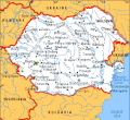
-

-
 similar map also labelled GNU


Article(s): Movement for unification of Romania and Moldova
Request: please color rivers in the eastern chunk blue to match rest of map, SVGify if possible. -- Chris (??? • ????) (talk) 16:05, 27 January 2008 (UTC)
Graphist opinion:
Comment: I do not have "eagles eyes", but it seems to me that the rivers on the eastern chuck are already blue, I might be wrong, or there is something wrong with the LCD, or I did not note them. A more experienced graphist could help here. Also, I tried to SVGify it via Inkscape, and I have to be honest with you, it will take a lengthy amount of time to accomplish this feat. Brightness cutoff at 0.5, or edge detection at 1, or color quantization at 50-all with 0.85 tolerance- would not work, perhaps because the large quantity of details in this rather low resolution image. Well, this would mean that all text sould be rewritten again using Arial, and then colouring the traced map... very time-consuming but doable nonetheless.I am sorry I could not be of help here, but an experienced graphist as I said before, could perhaps do the job better and faster, but not me :-(.Λua∫Wise (talk) 19:21, 28 January 2008 (UTC)
- The rivers surrounding the word MOLDOVA are a charcoal grey, compared to the other rivers. Thank you for trying, I appreciate it. Chris (??? • ????) (talk) 19:33, 28 January 2008 (UTC)
- If you enlarge the image until one pixel is 4 or 16 on your screen, you can see that the rivers
arewere a combination of blue pixels and tan pixels. Start by cutting away the problem area to a new layer, so Photoshop's little magic wand [my second most favorite thing in the world! ; ) ] won't also select things you don't want. Select the tan with magic wand, fill with blue. Repeat, as there are several shades of tan, as the wand was set to be very selective. Reassemble the layers. finis. Λua∫Wise (talk), we do appreciate that you came by, there's always plenty of images to work on. This page is usually a fun place to be, most graphists are good to try to help others, it's a good place to learn. Sagredo⊙☿♀♁♂♃♄ 01:01, 29 January 2008 (UTC)- Since both of them are GNU, can this one go to Commons? Chris (??? • ????) (talk) 01:31, 29 January 2008 (UTC)
- If you enlarge the image until one pixel is 4 or 16 on your screen, you can see that the rivers
- Am I? If so I did not mean to be. Chris (??? • ????) (talk) 03:24, 29 January 2008 (UTC)
- I was joking about the copy vio nazis over there. Sagredo⊙☿♀♁♂♃♄ 03:33, 29 January 2008 (UTC)
- Does anybody know the source of this image? It looks a little too fancy to me to be GNU-self. -- I. Pankonin (t·c) 06:45, 30 January 2008 (UTC)
- I was joking about the copy vio nazis over there. Sagredo⊙☿♀♁♂♃♄ 03:33, 29 January 2008 (UTC)
- I don't, I found a similar image also labeled GNU, with just slight modification of the northeast border, inclusive of Transdnistria, where the orange map is not. It seems to me I have seen the similar image as State Department numbers. Because the rivers were different colors originally, I would say it is somehow two images spliced together. Chris (??? • ????) (talk) 06:54, 30 January 2008 (UTC)
- the third image appears to be stitched together from the CIA Factbook maps of the two countries. It should be PD-GOV Sagredo⊙☿♀♁♂♃♄ 21:59, 30 January 2008 (UTC)
More SVGery
-
 ?1
?1 -
?2- jpg from Ind. embassy to France
-
?3- svg from Ind. gov't jpg
-
?4- png from Ind. gov't jpg
-
svg -lighten gold
-
svg-lighten gold lighten black
-
 hand drawn from Gov't image
 -
6000px


Articels: Indonesia and related (Including the copyright tag)
Request: SVGify 68.39.174.238 (talk) 19:08, 1 February 2008 (UTC)
Note: the Indonesian Government uses this and this and other versions appear here and here Sagredo⊙☿♀♁♂♃♄ 23:56, 5 February 2008 (UTC)
- So it sounds like more "If it fits the blazon..." work? 68.39.174.238 (talk) 02:02, 6 February 2008 (UTC)
Oppinion: I have seen perhaps a dozen slightly different State Seals of Montana in use by different parts of the state government. (Particularly when simplified to make a patch for a uniform, state highway patrol, for example.) In the case of this, I think our image should be more like a government version than the others. I made a version of one of the Indonesian government versions which appears above. It's obviously not drawn by hand, but isn't just an Inkie trace either. Tell me what you think. Sagredo⊙☿♀♁♂♃♄ 02:23, 6 February 2008 (UTC)
- Finally found the {{PD-IDGov}} template. So we could use either the Indonesian gov't jpg or the svg. I think the jpg is adequate for our needs, and I like the source. Sagredo⊙☿♀♁♂♃♄ 02:59, 6 February 2008 (UTC)
- I favor the jpg as a nice mid-range, the one Goldilocks would choose. Chris (??? • ????) (talk) 03:59, 6 February 2008 (UTC)
So the 3rd one looks like it? 68.39.174.238 (talk) 13:24, 6 February 2008 (UTC)
- Or Door No. 4, a png made from the gov't jpg. I think it looks better than the svg, it's got the transparent background. It could be redrawn by hand, but would be a lot of work. Part of the reason for the variation is that this is based on a very popular mythical eagle, a part of the local folklore. so many images, statues, etc are made of the thing. Sagredo⊙☿♀♁♂♃♄ 06:27, 7 February 2008 (UTC)
- 2 or 4, two seems to scale crisper. Chris (??? • ????) (talk) 06:30, 7 February 2008 (UTC)
- IMO 1 is still the best. The gov't JPG has thick outlines, the PNG is blurry, and there's far too much black in the SVG. I think the best solution here would be to manually trace the gov't raster so you can set the stroke width, but maybe the SVG can be saved by using a lightish-medium brown (like the outlines in this image) instead of black on the bird, and maybe a color of gold closer to the Vector-Images original.
- I saw this one when it was posted, and I knew it was trouble. -- I. Pankonin (t·c) 06:55, 7 February 2008 (UTC)
- I'll expirement with browns and grays instead of the black. Sagredo⊙☿♀♁♂♃♄ 18:06, 7 February 2008 (UTC)
- I like the last one. -- I. Pankonin (t·c) 00:43, 10 February 2008 (UTC)
- Those were made by separating the four colors in Photoshop, and tracing them one at at time in Inkscape. But I finally decided to redraw it by hand, and I'm nearly done. Can anybody tell me what the typeface is on Image no. 2? Sagredo⊙☿♀♁♂♃♄ 05:21, 10 February 2008 (UTC)
- Here is the version drawn by hand. Sagredo⊙☿♀♁♂♃♄ 23:32, 11 February 2008 (UTC)
- I like the last one. -- I. Pankonin (t·c) 00:43, 10 February 2008 (UTC)
- I'll expirement with browns and grays instead of the black. Sagredo⊙☿♀♁♂♃♄ 18:06, 7 February 2008 (UTC)
- Are the divisions between the four quadrants supposed to be visible on the inner black part? 68.39.174.238 (talk) 22:42, 12 February 2008 (UTC)
- I still see it in MW (Even after force refreshing and doing action=purge), but not if I view the SVG directly in Ffx 2.0.0.12. 68.39.174.238 (talk) 03:28, 13 February 2008 (UTC) (PS. I'm assuming the #s of feathers etc. are all the same)
The black part of the shield was originally 4 parts, but I combined them. It now only has 5 nodes, and the two at the top corners have been aligned to horizontal by Inkscape. With Inkscape you can zoom in until one pixel is about 2 inches, and the top of the black is absolutely straight and level. But I do see some of this effect a times. I believe it is an optical illusion where bright objects (white) appear larger than darker (red) ones. The new moon's crescent vs. the dark part of the moon lighted by earthshine. You can zoom in on the MW version a little by using Microsoft's magnifier Start>>Programs>>Accessories>>Accessibility>>Magnifier If you're an eyeglass wearer with a strong prescription (I am) you can cause a little of this by llooking through the top edge of your lenses vs the bottom edge. (Chromatic Aberration) I added a couple more feathers on top of the disappearing ones. Which seem not to disappear in MW. (????) The feathers on the legs still "move" when viewed in MW as opposed to Firefox or Inkscape, but look still look acceptable. I invite anyone with Inkscape to zoom in for a close look at the shield. I put up a version with the image set to 6000px wide so you can take a close look. Sagredo⊙☿♀♁♂♃♄ 07:01, 13 February 2008 (UTC)
- OK, I don't see the lines on the black anymore. Nice one. Incidentally I notice that the VI one doesn't have the supporting chain, while all the other (official) ones do! 68.39.174.238 (talk) 02:27, 14 February 2008 (UTC)
- I didn't notice that the VI version was lacking the chain, but noticed it seemed to simply (quickly?) done, a lot less work put into it. It's on a lot of pages, so the work seemed justified. Found the "bugs" in the leg feathers, too. I'd like to see the faces on some of the people when the eagle on their user page comes up different! Hope they consider it an improvement. Sagredo⊙☿♀♁♂♃♄ 05:48, 14 February 2008 (UTC)
So is there anything else or can we mark everything vva/7 and mark this resolv'd? 68.39.174.238 (talk) 19:24, 14 February 2008 (UTC)
- Err, could it be put on Commons? 68.39.174.238 (talk) 01:40, 15 February 2008 (UTC)
Should all the rasters uploaded just for this be deleted? 68.39.174.238 (talk) 21:25, 15 February 2008 (UTC)
- I think everything but the one you want to keep can be deleted. Sagredo⊙☿♀♁♂♃♄ 02:26, 16 February 2008 (UTC)
AIDS pandemic


Article(s):
Request: SVGify and, um, correctly spell it prevalence. Also, can anyone figure out what is meant by "doted" in the image description? -- Chris (??? • ????) (talk) 07:26, 1 February 2008 (UTC)
- Perhaps it means that the exact percentage is written on the country itself... --escondites 10:10, 1 February 2008 (UTC)
Graphist opinion: I think I can do this, it should be ready tomorrow. (Except if someone did it faster). --escondites 10:10, 1 February 2008 (UTC)
- Voila! Sorry that you had to wait so long! PS: The map legend should be made using the legend template to make a template in the picture caption instead. (Like in the article Central Africa)

- Is the map OK? --escondites 17:22, 4 February 2008 (UTC)
- I would say it's great, but before we mark this done, so that we can use the the legend template to make a template in the picture caption, would you tell me what each color# is so I can make the template accordingly, or would you put the legend in the text of the graphic itself? Sorry for missing replying to this one. Chris (??? • ????) (talk) 22:00, 4 February 2008 (UTC)
- Here is it, ready for copy and paste... and rice. --escondites 17:43, 5 February 2008 (UTC) :
{{legend|#787878|No data}} {{legend|#94bf8b|Less than 0.1 %}} {{legend|#f4e2ba|0.1-0.5 %}} {{legend|#eaca83|0.5-1 %}} {{legend|#f07568|1-5 %}} {{legend|#ff4800|5-15 %}} {{legend|#b00000|15-50 %}}
Which will look like this:
- Thank you, will you upload this to Commons, where the png map to be replaced is? Chris (??? • ????) (talk) 00:46, 6 February 2008 (UTC)
- It is, and was, already on Commons. --escondites 13:09, 6 February 2008 (UTC)
- Sorry, I knew I should have learned to read. @:^} Chris (??? • ????) (talk) 21:37, 6 February 2008 (UTC)
- Is there anything else to be changed? --escondites 12:26, 11 February 2008 (UTC)
- Recoded the articles, left the png on userpages for others to change only if they want, marking as done, thanks! Chris (??? • ????) (talk) 04:11, 12 February 2008 (UTC)
Fetus
-
 Embryo 4 weeks after conception
 -
 Fetus 8 weeks after conception
 -
 Fetus 18 weeks after conception
 -
 Fetus 38 weeks after conception
 -
-

-

-


Article(s): Fetus, Pregnancy, Prenatal Development
Request: Can you please improve these black an white images? Some people have noted that these black and white images contain artifacts. I made each of these images from a color-tinted version that can be found in the respective file histories (the color-tinted versions are also here, here, here, and here). Thanks.Ferrylodge (talk) 06:18, 6 February 2008 (UTC)
- It would also be a good idea to convert them to PNG, and to make the BG transparent! --escondites 13:19, 6 February 2008 (UTC)
- Hi Escondites. I'm not an expert on images. Can you please explain briefly? Thanks.Ferrylodge (talk) 15:21, 6 February 2008 (UTC)
- Because JPGs should be used on Wikipedia only as photographs, and everything else should be PNG, or preferably SVG, and GIFs only for animation, there's a policy page about all this somewhere, but I forget it... --escondites 18:08, 6 February 2008 (UTC)
- Ah, okay, thanks. Anyway, I hope someone can put these images in good shape.Ferrylodge (talk) 18:30, 6 February 2008 (UTC)
- Because JPGs should be used on Wikipedia only as photographs, and everything else should be PNG, or preferably SVG, and GIFs only for animation, there's a policy page about all this somewhere, but I forget it... --escondites 18:08, 6 February 2008 (UTC)
Graphist opinion:
- Well, what did you two bright guys come up with? Jpeg or png? I'll do either... XcepticZP (talk) 16:37, 7 February 2008 (UTC)
- There are JPEGs here. BTW: Ferrylodge, is there a special reason you made black and white versions of these images?--escondites 18:21, 7 February 2008 (UTC)
- I made black and white versions of these images because several editors objected to the color images in the Fetus article. You can visit the talk page for that article to see their reasons. I did not see anything wrong with the color versions, but the images would not have been allowed into the article unless converted to black and white, so I complied. However, the black and white images that I created apparently could be better quality, because they include "artifacts" that ought to be removed.
- There are JPEGs here. BTW: Ferrylodge, is there a special reason you made black and white versions of these images?--escondites 18:21, 7 February 2008 (UTC)
- XcepticZP, I have no idea about Jpeg versus Png. If Escondites is correct that Png is better, then please do Png. Is there any advantage to doing Jpeg instead? Ferrylodge (talk) 22:46, 7 February 2008 (UTC)
- I get it! Inaccuracy in favor of POV! -- I. Pankonin (t·c) 06:36, 8 February 2008 (UTC)
- I was glad to at least get inclusion of the B&W images, after considerable efforts.Ferrylodge (talk) 07:22, 8 February 2008 (UTC)
- I get it! Inaccuracy in favor of POV! -- I. Pankonin (t·c) 06:36, 8 February 2008 (UTC)
- XcepticZP, I have no idea about Jpeg versus Png. If Escondites is correct that Png is better, then please do Png. Is there any advantage to doing Jpeg instead? Ferrylodge (talk) 22:46, 7 February 2008 (UTC)
- Here's my attempt at it, but I couldn't do transparency --escondites 10:15, 8 February 2008 (UTC):


- Thanks, it's much appreciated. The eye of the 8-week fetus ought to be filled in (I can do that); otherwise the images look okay to me. Please let me know if I should go ahead and overwrite the old B&W images.Ferrylodge (talk) 16:53, 8 February 2008 (UTC)
- Which 8 week fetus? Hmm... You actually can't overwrite the old B&W images, as they're JPEGs while these are PNGs. --escondites 19:09, 8 February 2008 (UTC)
- The second image from the left has a little white spot in the eye that shouldn't be there. I called it the "8 week fetus" because it's 8 weeks after conception (which is the same thing as 10 weeks gestational age). Anyway, if you're pretty sure that it's improper to use jpegs for these images, then I suppose that means every wiki project article that is now using jpegs should be edited. I could do that for the English Wikipedia, I suppose, but it would be so much simpler to just upload better B&W jpegs to overwrite the older B&W jpegs.Ferrylodge (talk) 19:48, 8 February 2008 (UTC)
- There's actually a bot on Wikipedia that does that very thing so you don't have to! -- I. Pankonin (t·c) 00:54, 9 February 2008 (UTC)
- You folks know more about this than I do, but I just visited that bot, and it looks like it converts an image from jpef to png, but I didn't see that the bot changes all the links to an image from jpeg to png. Anyway, whatever you folks think is best will probably work for me.Ferrylodge (talk) 02:08, 9 February 2008 (UTC)
- I took care of it. I apologize, I didn't mean to badger you. -- I. Pankonin (t·c) 05:41, 9 February 2008 (UTC)
- No need to apologize. I agree with you that NPOV has not prevailed here, and I appreciate your concern about it. Do you think it might be worthwhile to change the file names? It seems kind of weird to have a file name that says the image is in color when it's really in black and white (it might also be worthwhile to indicate in the file name that the first image is an embryo and the other three images are of a fetus). And as I already mentioned, the white spot in the eye of the 10-week image should be filled in, as in the crummy black and white images. Additionally, the bot description said that "this bot preserves" the history, but it doesn't look like the history was preserved. And should the color images also be converted to png?Ferrylodge (talk) 05:47, 9 February 2008 (UTC)
- Ipankonin, your edits to the Fetus article have been reverted. See here. I cannot deal with the reverter, but you are welcome to try. Do all of the images at the Fetus article now have "artifacts"? I cannot tell because the artifacts never showed up on my computer screen (other people complained about them).Ferrylodge (talk) 19:07, 9 February 2008 (UTC)
- No need to apologize. I agree with you that NPOV has not prevailed here, and I appreciate your concern about it. Do you think it might be worthwhile to change the file names? It seems kind of weird to have a file name that says the image is in color when it's really in black and white (it might also be worthwhile to indicate in the file name that the first image is an embryo and the other three images are of a fetus). And as I already mentioned, the white spot in the eye of the 10-week image should be filled in, as in the crummy black and white images. Additionally, the bot description said that "this bot preserves" the history, but it doesn't look like the history was preserved. And should the color images also be converted to png?Ferrylodge (talk) 05:47, 9 February 2008 (UTC)
- I took care of it. I apologize, I didn't mean to badger you. -- I. Pankonin (t·c) 05:41, 9 February 2008 (UTC)
- You folks know more about this than I do, but I just visited that bot, and it looks like it converts an image from jpef to png, but I didn't see that the bot changes all the links to an image from jpeg to png. Anyway, whatever you folks think is best will probably work for me.Ferrylodge (talk) 02:08, 9 February 2008 (UTC)
- There's actually a bot on Wikipedia that does that very thing so you don't have to! -- I. Pankonin (t·c) 00:54, 9 February 2008 (UTC)
- The second image from the left has a little white spot in the eye that shouldn't be there. I called it the "8 week fetus" because it's 8 weeks after conception (which is the same thing as 10 weeks gestational age). Anyway, if you're pretty sure that it's improper to use jpegs for these images, then I suppose that means every wiki project article that is now using jpegs should be edited. I could do that for the English Wikipedia, I suppose, but it would be so much simpler to just upload better B&W jpegs to overwrite the older B&W jpegs.Ferrylodge (talk) 19:48, 8 February 2008 (UTC)
- Which 8 week fetus? Hmm... You actually can't overwrite the old B&W images, as they're JPEGs while these are PNGs. --escondites 19:09, 8 February 2008 (UTC)
- Thanks, it's much appreciated. The eye of the 8-week fetus ought to be filled in (I can do that); otherwise the images look okay to me. Please let me know if I should go ahead and overwrite the old B&W images.Ferrylodge (talk) 16:53, 8 February 2008 (UTC)
(undent) I thought about the name, but I didn't think it would be a big deal. I guess somebody reverted without looking at the pictures. I didn't use the bot that I mentioned earlier, because the PNG files already existed (actually, I'm not sure that bot does Commons images). Escon, would you mind uploading them under new file names? -- I. Pankonin (t·c) 23:45, 9 February 2008 (UTC)
- You mean excluding the word "color"? --escondites 14:31, 10 February 2008 (UTC)
- Yes. -- I. Pankonin (t·c) 23:07, 10 February 2008 (UTC)
- Done. --escondites 12:32, 11 February 2008 (UTC)
- Yes. -- I. Pankonin (t·c) 23:07, 10 February 2008 (UTC)
- You mean excluding the word "color"? --escondites 14:31, 10 February 2008 (UTC)
- It would be really nice if the images that you want us to use would include the file histories. Anyway, thanks for your continuing assistance.Ferrylodge (talk) 04:10, 10 February 2008 (UTC)
Thanks for the new images, Escondites. Ipankonin, will you be trying to insert the new links into the articles?Ferrylodge (talk) 23:58, 11 February 2008 (UTC)
- Yes, and I'm working on file histories as well. -- I. Pankonin (t·c) 12:12, 12 February 2008 (UTC)
- That's all done. Anything else we can do for you? -- I. Pankonin (t·c) 08:17, 13 February 2008 (UTC)
Thank you very much, Ipankonin and Escondites, for your help with this. I guess we're all set for now. Ferrylodge (talk) 20:50, 14 February 2008 (UTC)
Dover Athletic F.C. badge
-
Badge of Dover Athletic F.C.
Article(s): Dover Athletic F.C.
Request: Is it possible for a SVG version of this image to be created......? ChrisTheDude (talk) 16:46, 7 February 2008 (UTC)
Graphist opinion: I'll get this. Sagredo⊙☿♀♁♂♃♄ 21:18, 12 February 2008 (UTC) How's this?
- That's excellent, many thanks!!!! ChrisTheDude (talk) 07:54, 14 February 2008 (UTC)
Oklahoma State Quarter
-
 Oklahoma

Article(s): 50 State Quarters
Request: Is it possible to improve the Oklahoma image to be the same as the other quarter images on the article? Thanks - User:CPacker 03:04, 9 February 2008 (CST)
Graphist opinion:
- Image:2008 OK Proof.png is the image you're looking for. Same coin but a proof strike.
Lock
-

-
 edit
edit
Pages: Adnarim and Commons
Request: This may be a little selfish, but can someone make another lock and change the color of the lock background to THIS COLOR and THIS COLOR for me, Commons, and people who like pink. :-P Cheers. miranda 13:30, 10 February 2008 (UTC)
Graphist opinion:
- How is the edit I created? The colors are a very close approximation that I did by eye.-Andrew c [talk] 16:02, 10 February 2008 (UTC)
Great I love the dark colored version. Can you do the light one as well? Thanks so much! miranda 17:07, 10 February 2008 (UTC)- I think this will be great for now. Thank you so much! miranda 17:23, 10 February 2008 (UTC)
- Oh, I misunderstood your request. I made a version that used both the light and darker pinks instead of the orange and yellows of the original. I can make an even lighter version if you want, or if this one is sufficient, I won't ;) -Andrew c [talk] 02:09, 11 February 2008 (UTC)
- This is great. No extra work is needed. Thanks! miranda 02:36, 11 February 2008 (UTC)
- Oh, I misunderstood your request. I made a version that used both the light and darker pinks instead of the orange and yellows of the original. I can make an even lighter version if you want, or if this one is sufficient, I won't ;) -Andrew c [talk] 02:09, 11 February 2008 (UTC)
Republic of Formosa's Flags
-
 Flag #1
 -
 Flag #2
 -
 SVG
SVG -
 Bonus: SVG Seal of Formosa


Article(s): Republic of Formosa
Request: The article has two similar flags, neither vectorized. They are different(cloud color), but I'm not sure which is the right one. So, I'd like both of them vectorized. -- Jedravent (talk) 16:35, 10 February 2008 (UTC)
Graphist opinion: How's this? I'm happy to make adjustments, but without a bigger bitmap image to work from it's hard to improve on the style. A period NY Times article says the emblem is on a blue field, so I used flag 1 as the model for color, but it can be changed very easily. Jeff Dahl (Talk • contribs) 19:32, 13 February 2008 (UTC)
- There is a noticable border around the flag. That should be removed. --Jedravent (talk) 22:51, 15 February 2008 (UTC)
- Those are flags? That's cool, especially the vector version. 68.39.174.238 (talk) 19:27, 14 February 2008 (UTC)
Excellent work on the Seal, I was thinking of filing for that! 68.39.174.238 (talk) 20:46, 17 February 2008 (UTC)
Thanks for this. Oh, and that IP isn't me. --Jedravent (talk) 03:43, 18 February 2008 (UTC)
- I can confirm that ;D. 68.39.174.238 (talk) 05:01, 18 February 2008 (UTC)
BBFC Certificate
-
BBFC 15 certificate
Article(s): BBFC
Request: There is dirty/haze/noise around the edge of the black border. Could this be cleaned away please? Also, is it possible to SVGify this image? Mangwanani (talk) 21:20, 10 February 2008 (UTC)
Graphist opinion: I see no noise, only antialiasing... Stannered (talk) 00:28, 13 February 2008 (UTC)My bad, I see it now. Stannered (talk) 00:30, 13 February 2008 (UTC)
- Removed the noise around the edges...And optimized png. XcepticZP (talk) 12:48, 13 February 2008 (UTC)
first second... worlds
-

-
 SVG
SVG


Article(s): First World et al
Request: SVGify, make oceans white and borders between nations to match Wiki standardized maps -- Chris (??? • ????) (talk) 23:54, 10 February 2008 (UTC)
- Also, it may be worth noting the comments on the image talk page. 68.39.174.238 (talk) 02:48, 11 February 2008 (UTC)
- Those are each addressed in the present iteration of the map, except I would be hesitant to put Turkey on the list of Firsters. Chris (??? • ????) (talk) 06:24, 11 February 2008 (UTC)
Graphist opinion: Maybe we should open up a discussion on this. The template {{Three worlds}} says it's during the cold-war era, but other countries mentioned on the talk page are in their present state, not what they were in the cold war according to the comments. (SVG added) -- I. Pankonin (t·c) 04:21, 16 February 2008 (UTC)
- The map is far superior, and I would mark this as done, but would support discussion. Are you suggesting having a then-map and a now-map? Chris (??? • ????) (talk) 04:27, 16 February 2008 (UTC)
- oops, wait, East Germany and the Czech Republic should be red, for that period. Chris (??? • ????) (talk) 04:29, 16 February 2008 (UTC)
- Well, since the second world kind of collapsed on itself, it's probably not worth it to have a current map. I would like to see some sources though. Corrections are coming. -- I. Pankonin (t·c) 05:54, 16 February 2008 (UTC)
- Divided Germany; united Czechoslovakia, Yugoslavia, and the USSR. I imagine that's why there were no country borders in the first place. It's a lot of work. -- I. Pankonin (t·c) 07:05, 16 February 2008 (UTC)
- And thank you for that lot of hard work! done!
New York Court of Seals and Coats of Arms
-
Image to be replaced
-
 Design
 -
 SVG
SVG


Articels: New York State Court of Appeals and related cases
Request: SVGify. You can get the center logo from the state flag (Already an SVG), turn it to black and white, and then add the surrounding text. 68.39.174.238 (talk) 04:08, 11 February 2008 (UTC) (PS. Could you also upload the SVG with a more explicit name? "NY COA seal" sounds like "New York Coat of Arms seal", which is erroneous. Thanx)
Oppinion: How's this? The font is Georgia, which is the best match I could find based on the small raster version. I wasn't able to find any higher res version on their website or google image search. I also took a guess that those dots separating the text are stars. Jeff Dahl (Talk • contribs) 01:56, 17 February 2008 (UTC)
- I don't think anyone can really dispute much of anything: The raster is such a poor resolution. If anyone can turn up a better image or an authoritative explanation of it, it can be easily changed. 68.39.174.238 (talk) 05:44, 17 February 2008 (UTC)
Oil well in Colorado

Article(s): Colorado
Request: Can the date in the bottom be removed, and the image elsewhere be improved? Thanks. -- escondites 10:22, 15 February 2008 (UTC)
Graphist opinion:
- It's possible to remove the date, but it'll be a big work if it's going to look good. The images is also very noisy. Wouldn't it be better if we just took another images, I mean really it's a lot of work for a kinda small image. --Henrikb4 (talk) 13:47, 15 February 2008 (UTC)
- I'm on this. I will attempt it. But I make no guarantees it will look very nice when zoomed in! :) XcepticZP (talk) 16:23, 15 February 2008 (UTC)
- Well, it turned out quite well. Wasn't time consuming. Mark as finished if this is acceptable. XcepticZP (talk) 16:34, 15 February 2008 (UTC)
- Merci! You did a good job on that! --escondites 18:40, 15 February 2008 (UTC)
- Well, it turned out quite well. Wasn't time consuming. Mark as finished if this is acceptable. XcepticZP (talk) 16:34, 15 February 2008 (UTC)
- I'm on this. I will attempt it. But I make no guarantees it will look very nice when zoomed in! :) XcepticZP (talk) 16:23, 15 February 2008 (UTC)
Federal patch


Articels: TRADOC and templated pages.
Request: SVGify. 68.39.174.238 (talk) 20:04, 16 February 2008 (UTC)
Oppinion: Done. Jeff Dahl (Talk • contribs) 01:09, 17 February 2008 (UTC)
- Done. 68.39.174.238 (talk) 05:25, 17 February 2008 (UTC)
House Committee on Agriculture
-
 Orig
Orig

Article(s): United States House Committee on Agriculture
Request: Brighten please. -- I. Pankonin (t·c) 04:51, 17 February 2008 (UTC)
Graphist opinion: Completed. XcepticZP (talk) 13:28, 17 February 2008 (UTC)
- Done. -- I. Pankonin (t·c) 01:19, 18 February 2008 (UTC)
Official coat of Hungary
-
 Swipe the Crown from here...
 -
 ...to vectorize this.
 -
Finished image.
.svg)

Articels: Anything to do with Hungary
Request: SVGify. The crown is already vectorized on the collaborationist state's coat, so can be taken from there. The shield proper should be easy? 68.39.174.238 (talk) 05:51, 17 February 2008 (UTC)
Opinion: I'll do this. XcepticZP (talk) 17:04, 17 February 2008 (UTC)
- Excellent, that's one I've been wanting done for a long time but haven't asked because of the complexity of the crown. Now that someone else has done it (The crown), all the other Hungarian coats should be easy! Thanx. 68.39.174.238 (talk) 23:58, 17 February 2008 (UTC)
Statue of Mentuhotep
-
 Statue of Mentuhotep
 -


Article(s): Ancient Egypt
Request: Can someone clone out the junk in the upper left corner please? -- Jeff Dahl (Talk • contribs) 05:55, 17 February 2008 (UTC)
- And maybe brighten it a notch for detail, glad my home monitor is crappy. Chris (??? • ????) (talk) 06:52, 17 February 2008 (UTC)
Graphist opinion: I really do not understand what junk you want removed. I see some scaffolding of some sort. Is it really necessary to remove? I can brighten and stuff easily for this image. But rebuilding a curved wall with clone isn't the easiest of tasks. XcepticZP (talk) 17:36, 17 February 2008 (UTC)
- Yeah, just the scaffolding in the small area at the top. Whatever I can get would be appreciated. Jeff Dahl (Talk • contribs) 17:46, 17 February 2008 (UTC)
Kosovo QNVK nationalist colors
-
image to be cleaned
-
large, clean, apolitical base image to use
Article(s): Savez Izviđača Srbije i Crne Gore
Request: I'm not in the habit of asking for modern Scout emblems to be fixed, but in the wake of the 2008 Kosovo declaration of independence this is actually timely. The original image came from another Wikipedia, and it has all sorts of artifacts, can it be cleaned, even if SVGification is necessary? -- Chris (??? • ????) (talk) 20:05, 17 February 2008 (UTC)
- also note, some of the e's have an umlaut, thus Qendra Nacionale e Vëzhguseve të Kosovës Chris (??? • ????) (talk) 20:17, 17 February 2008 (UTC)
Graphist opinion: I'll work on this. Sagredo
- Done? I hope. Oh gawd, I hope this sucker is done! Sagredo⊙☿♀♁♂♃♄ 05:31, 18 February 2008 (UTC)
- Done indeed, my friend, and you've done wonders with it! Who puts red and black together against all the rules of heraldry anyway? *shudders* Thanks once again as always! Chris (??? • ????) (talk) 05:43, 18 February 2008 (UTC)
approved logo of the Provisional Institutions of Self Government
-
 Flag from Wikinews
 -
 Someone else got there 1st...


Article(s): Coat of arms of Kosovo
Request: Um, guess. ;) -- Chris (??? • ????) (talk) 20:57, 17 February 2008 (UTC)
Graphist opinion: Is that what you were after? 68.39.174.238 (talk) 23:50, 17 February 2008 (UTC)
- Perfect, thank you! Chris (??? • ????) (talk) 00:53, 18 February 2008 (UTC)
- Oh, I see, it already existed. Sneaky... ;) Chris (??? • ????) (talk) 00:56, 18 February 2008 (UTC)
- Sorry, I meant to put it above the line, not below it. Anyway, someone was FAST. 68.39.174.238 (talk) 01:53, 18 February 2008 (UTC)
ZESA
-
ZESA logo
-
svg
Article(s): ZESA
Request: I got the image from [9] and have tried to clean it up but not very well. Could an SVG be made to replace it? Thanks Mangwanani (talk) 13:42, 6 February 2008 (UTC)
Graphist opinion: I'll work on it. -- I. Pankonin (t·c) 04:06, 11 February 2008 (UTC)
- How's that? -- I. Pankonin (t·c) 05:30, 11 February 2008 (UTC)
- Perfect. ThanksMangwanani (talk) 14:19, 12 February 2008 (UTC)
- Are they exactly specified? This being a CoA there is probably alot of room for variation (I suspect they don't even have an internal consistency). 68.39.174.238 (talk) 02:29, 14 February 2008 (UTC)
- They aren't really wrong. You have a look at the image on their website it is a bit hazy and googling it comes up with a spectrum of variation and an old energy bill I have the bits are white not yellow... Mangwanani (talk) 20:54, 14 February 2008 (UTC)
- Are they exactly specified? This being a CoA there is probably alot of room for variation (I suspect they don't even have an internal consistency). 68.39.174.238 (talk) 02:29, 14 February 2008 (UTC)
- I went to the source and looked at the original image. It's a very pale raster,
but I'm sure I got the colors right. The cleaned-up raster version is a bit misleading. What tipped me off was that it's obviously water in the lower left, but I've never seen water colored blue and yellow. The only thing I'm not sure about is whether the scroll is lined with blue or black.-- I. Pankonin (t·c) 05:25, 15 February 2008 (UTC)- At the top of the ZESA page is an image of about a third of the logo without the yellow overlay. You can see the colors of the banner, but it doesn't help for the water. Which could be white or yellow or transparent; all would look yellow under the overlay. Look at the star behind the torch, it is transparent. Sagredo⊙☿♀♁♂♃♄ 06:53, 16 February 2008 (UTC)
- I can see the whole logo. I guess I never waited for the page to load. The "water" is definitely yellow. -- I. Pankonin (t·c) 08:13, 16 February 2008 (UTC)
- Didn't see that bit either tbh. The E in ZESA isnt quite right. Bit too rounded... Mangwanani (talk) 19:12, 16 February 2008 (UTC)
- How's that? -- I. Pankonin (t·c) 03:47, 18 February 2008 (UTC)
- Thats better. Thanks very much. Will mark it as done. Mangwanani (talk) 16:25, 19 February 2008 (UTC)
- How's that? -- I. Pankonin (t·c) 03:47, 18 February 2008 (UTC)
- Didn't see that bit either tbh. The E in ZESA isnt quite right. Bit too rounded... Mangwanani (talk) 19:12, 16 February 2008 (UTC)
- I can see the whole logo. I guess I never waited for the page to load. The "water" is definitely yellow. -- I. Pankonin (t·c) 08:13, 16 February 2008 (UTC)
- At the top of the ZESA page is an image of about a third of the logo without the yellow overlay. You can see the colors of the banner, but it doesn't help for the water. Which could be white or yellow or transparent; all would look yellow under the overlay. Look at the star behind the torch, it is transparent. Sagredo⊙☿♀♁♂♃♄ 06:53, 16 February 2008 (UTC)
- I went to the source and looked at the original image. It's a very pale raster,
Apollonian Gasket
-
 Apollonian Gasket
 -
 SVG
SVG


Article(s): Problem of Apollonius
Request: I believe this image would be far better if provided as a Scalable Vector Graphic. Conversion would be simple for one with the appropriate skills. -- Horst.Burkhardt (talk) 12:22, 14 February 2008 (UTC)
Addendum: It may be more profitable to base the SVG on this image (the original source image) so as to get higher detail. -- Horst.Burkhardt (talk) 13:10, 14 February 2008 (UTC)
Graphist opinion:
- I really do not think this should be represented by an svg. Fractals do not scale well. If you scale them up, you will need to reiterate it to have smaller details. I think this should be in png format. XcepticZP (talk) 13:53, 14 February 2008 (UTC)
- I beg to differ - not only is this a sequence of fractals, but it is also a bunch of circles in a pattern. Surely that means the SVG would be a very very simple thing to create? As long as you can somehow lock the pattern in place (group all the objects) it would be more than possible to create an SVG. Nonetheless, i'll work on a PNG of it when i have time. Horst.Burkhardt (talk) 13:59, 14 February 2008 (UTC)
- It's possible (though complicated and time-intensive) to take the original fractal algorithm and code a program to produce the SVG. It would be more accurate that way, but the question is whether or not somebody actually wants to try. Depending on how far down you go, it would probably pass WP:FPC right away. Seems like a challenging project if somebody wants to try. -- I. Pankonin (t·c) 05:15, 15 February 2008 (UTC)
- I'm tempted to try an automated SVG, so I'll give that a go but if it hasn't appeared in a couple of weeks I'll have given up ; ). In the meantime I'll convert the GIF to a PNG, just on general principles. Time3000 (talk) 15:47, 15 February 2008 (UTC)
- I've done an SVG; it takes a while (in the region of a second) to render on firefox using this machine as there's a lot of detail, but that shouldn't be a problem. Time3000 (talk) 13:53, 18 February 2008 (UTC)
- If it's not too difficult, I would take the stroke width down to .25 and fill in the empty spots that appear. I wouldn't worry about the size until it gets above a megabyte. Did you really automate it? -- I. Pankonin (t·c) 10:53, 19 February 2008 (UTC)
- Using .25 for stroke width gives a very washed-out image, so I used .5 instead which does improve it. Yes, I did automate it, which was... a challenge. The idea is so simple, but you have to bring in some fairly advanced geometrical ideas to actually quantify it. I guess I have MathWorld to thank for most of those. Time3000 (talk) 13:11, 19 February 2008 (UTC)
- Some gaps appeared because of the stroke change. -- I. Pankonin (t·c) 07:05, 22 February 2008 (UTC)
- Using .25 for stroke width gives a very washed-out image, so I used .5 instead which does improve it. Yes, I did automate it, which was... a challenge. The idea is so simple, but you have to bring in some fairly advanced geometrical ideas to actually quantify it. I guess I have MathWorld to thank for most of those. Time3000 (talk) 13:11, 19 February 2008 (UTC)
- If it's not too difficult, I would take the stroke width down to .25 and fill in the empty spots that appear. I wouldn't worry about the size until it gets above a megabyte. Did you really automate it? -- I. Pankonin (t·c) 10:53, 19 February 2008 (UTC)
- I've done an SVG; it takes a while (in the region of a second) to render on firefox using this machine as there's a lot of detail, but that shouldn't be a problem. Time3000 (talk) 13:53, 18 February 2008 (UTC)
- I'm tempted to try an automated SVG, so I'll give that a go but if it hasn't appeared in a couple of weeks I'll have given up ; ). In the meantime I'll convert the GIF to a PNG, just on general principles. Time3000 (talk) 15:47, 15 February 2008 (UTC)
- It's possible (though complicated and time-intensive) to take the original fractal algorithm and code a program to produce the SVG. It would be more accurate that way, but the question is whether or not somebody actually wants to try. Depending on how far down you go, it would probably pass WP:FPC right away. Seems like a challenging project if somebody wants to try. -- I. Pankonin (t·c) 05:15, 15 February 2008 (UTC)
- I beg to differ - not only is this a sequence of fractals, but it is also a bunch of circles in a pattern. Surely that means the SVG would be a very very simple thing to create? As long as you can somehow lock the pattern in place (group all the objects) it would be more than possible to create an SVG. Nonetheless, i'll work on a PNG of it when i have time. Horst.Burkhardt (talk) 13:59, 14 February 2008 (UTC)
Zimbabwe flag/map
-
 This and
 -
 this should be useful.
 -
 SVG outline


Article(s): Zimbabwe stubs
Request: SVGery to be similar to Image:SouthAfricanStub.png Mangwanani (talk) 19:30, 16 February 2008 (UTC)
Also worth noting, Country stub pictures at the commons. Most are SVGs, but there are a couple of egregiously bad rasters that could do with an SVGing. 68.39.174.238 (talk) 20:30, 16 February 2008 (UTC)
- Added elements of map and flag. 68.39.174.238 (talk) 00:02, 18 February 2008 (UTC)
Graphist opinion: Here it is. Jeff Dahl (Talk • contribs) 20:57, 18 February 2008 (UTC)
- Marked as VVA and changed all the templates. Hope I didn't jump the gun. 68.39.174.238 (talk) 22:36, 18 February 2008 (UTC)
- Could the flag be smaller in the country outline so we can see more of the stripes or is this not possible?Mangwanani (talk) 16:23, 19 February 2008 (UTC)
- Yes, but I would have to alter the proportions of the flag, specifically, I'd make the star/logo smaller and move it to the left. Jeff Dahl (Talk • contribs) 16:52, 19 February 2008 (UTC)
- Uploaded a new version with the central emblem altered to fit more of the stripes. Jeff Dahl (Talk • contribs) 17:02, 19 February 2008 (UTC)
- That'll do lovely. Many thanks. Mangwanani (talk) 17:18, 23 February 2008 (UTC)
- Could the flag be smaller in the country outline so we can see more of the stripes or is this not possible?Mangwanani (talk) 16:23, 19 February 2008 (UTC)
UN countries
-
 Map of UN member states
 -
 Can be taken from here
 -
 Completed vector image.


Article(s): United Nations, United Nations member states and many other pages
Request: To Vectorise image for enhanced quality. The UN square can be taken from the UN flag which is already vectorised. Thanks Mangwanani (talk) 13:33, 17 February 2008 (UTC)
Graphist opinion: Finished. XcepticZP (talk) 17:57, 17 February 2008 (UTC)
- I'm Not sure about the proportions. Flags usually have to be exact. -- I. Pankonin (t·c) 01:24, 18 February 2008 (UTC)
- Agree. The proportions for the SVG aren't quite the same. Any progress on the map? Mangwanani (talk) 18:35, 18 February 2008 (UTC)
- Ok, will do it in a bit. I'll get the proportions right. I didn't think it would matter much. XcepticZP (talk) 18:31, 19 February 2008 (UTC)
- Finished, i followed the png proportions exactly. Hope its good :) XcepticZP (talk) 18:59, 21 February 2008 (UTC)
- Yeah, thats better. Ta Mangwanani (talk) 19:15, 21 February 2008 (UTC)
- Finished, i followed the png proportions exactly. Hope its good :) XcepticZP (talk) 18:59, 21 February 2008 (UTC)
- Ok, will do it in a bit. I'll get the proportions right. I didn't think it would matter much. XcepticZP (talk) 18:31, 19 February 2008 (UTC)
- Agree. The proportions for the SVG aren't quite the same. Any progress on the map? Mangwanani (talk) 18:35, 18 February 2008 (UTC)
Kosovo coat of arms
-
 to be SVGified

Article(s): Kosovo
Request: This interim seal for Kosovo needs to be turned into an .svg please. Thanks -- 67.41.182.153 (talk) 17:57, 17 February 2008 (UTC)
Graphist opinion: Here you go:
-
 COA of Kosovo

--Martin23230 (talk) 20:13, 17 February 2008 (UTC)
- Changed image since it's been uploaded to Commons w/ a different name. If nothing else, this independancy has created a load of confusion on the coats of the country (The UN one and the new one). 68.39.174.238 (talk) 23:57, 17 February 2008 (UTC)
- You know what I mean... 68.39.174.238 (talk) 22:31, 18 February 2008 (UTC)
Matt Sanchez
Articles: Matt Sanchez
Request: Can this be cropped so we can also have a head shot and any appropriate quality enhancement? We need a decent headshot for the bio box. Benjiboi 12:23, 18 February 2008 (UTC)
Opinion: The copyright status for the images you request would be a nightmare. I'm not doing it, sorry. XcepticZP (talk) 17:12, 18 February 2008 (UTC)
- (sigh). We had the copyright settled with permission from the owner but now the image has been deleted as replaceable. Sorry about that. Benjiboi 11:46, 19 February 2008 (UTC)
CoA Kurdistan
-
 Coat of Arms of Iraqi Kurdistan
 -
 SVG
SVG


Article(s):general places. The Coat of arms of Kurdistan Regional Government links to two highversions of the image.
Request:A SVG version so we can use it on multiple pages instead of this small version -- 212.187.1.213 (talk) 16:37, 19 February 2008 (UTC)
Graphist opinion:
How's that? Time3000 (talk) 18:05, 19 February 2008 (UTC)
- I'm assuming you have the document saved somehow and you can edit it very fast. As seen here the eagle has a sharp mouth and looks a little "angry". If you could edit that very fast i'd be ever happier than i am now. Tnx 212.187.1.213 (talk) 22:05, 19 February 2008 (UTC)
- Should we then also be incorporating the text and the dates? Chris (??? • ????) (talk) 22:18, 19 February 2008 (UTC)
- I've changed the eagle's head, but I'm also thinking about the text and dates on the PDF - is it simply a slightly different coat of arms or an old/new version or something? And which (original JPEG or PDF) should the SVG follow? Time3000 (talk) 10:35, 20 February 2008 (UTC)
- It should follow the JPG, the PDF was just to show you the head. So its perfect as it is, Many Many thanks 212.187.1.213 (talk) 17:18, 20 February 2008 (UTC)
- I've changed the eagle's head, but I'm also thinking about the text and dates on the PDF - is it simply a slightly different coat of arms or an old/new version or something? And which (original JPEG or PDF) should the SVG follow? Time3000 (talk) 10:35, 20 February 2008 (UTC)
- Should we then also be incorporating the text and the dates? Chris (??? • ????) (talk) 22:18, 19 February 2008 (UTC)
South Africa COA
-
The SVG version from the PDF
Article(s): South_Africa + lots others.
Request: SVG-ify this COA. Don't be intimidated by the licence. Thanks in advance. XcepticZP (talk) 17:21, 19 February 2008 (UTC)
Graphist opinion:
- Has anyone checked at Commons as to, erm, why an excellent SVG version () was deleted on the 16th? Fvasconcellos (t·c) 10:12, 20 February 2008 (UTC)
- Yeah. I've also seen once that there was a vector version of this... Well, here's why it got deleted --escondites 10:32, 20 February 2008 (UTC):
- 01:44, 16 February 2008 Maxim (Talk | contribs) deleted "Image:Coat of arms of South Africa.svg" ?(Deleted because "In category Unknown as of 3 February 2008; no license/permission/source". using TW)
- If licensing is not a problem, I'd recommend extracting from the government's official branding guidelines. The motto is incorrectly rendered in the Vector-Images PNG, by the way :) Fvasconcellos (t·c) 10:25, 20 February 2008 (UTC)
- Well, I'll extract the logo from the PDF for you, feel free to nominate the file I upload for deletion if you like. I can't understand Wikipedia:Copyright on emblems well enough to tell what is allowed, but I prefer it being deleted rather than being a vandal. Jackaranga (talk) 16:42, 20 February 2008 (UTC)
Pakistani partizan flags


Articles: The respective parties articels, various people, and electoral templates of Pakistan.
Request: SVGify. Note that the 1st one is a really minor difference from the official flag. 68.39.174.238 (talk) 03:55, 20 February 2008 (UTC)
Opinion: Done. Fvasconcellos (t·c) 11:06, 20 February 2008 (UTC)


Perfect. 68.39.174.238 (talk) 12:07, 20 February 2008 (UTC)
Thatcher Signature
Article(s): Margaret Thatcher
Request: AS per my request for Mugabe Signature. SVG. Thanks. Mangwanani (talk) 20:24, 21 February 2008 (UTC)
Graphist opinion: Here is my humble attempt at it. How does it look? Λua∫Wise (Operibus anteire) 11:11, 22 February 2008 (UTC)
- Thats great thanks. Will mark as done. Mangwanani (talk) 16:33, 22 February 2008 (UTC)
Map of Madagascar
-
 Map of Madagascar
 -


Article(s): Geography of Madagascar, List of cities in Madagascar, Music of Madagascar, Ankarana Reserve, Tsingy de Bemaraha Strict Nature Reserve, Masoala National Park, Nosy Mangabe, Andohahela National Park, Makira Natural Park, Amber Mountain National Park, Andasibe-Mantadia National Park, Beza Mahafaly Reserve, Menabe Reserve, Mahavavy-Kinkony, Montagne des Francais, Ankeniheny-Zahamena Reserve
Request: Would like to have in SVG format. (I also want to use it as a base to make a range map for the Madagascan species of Omphalea which I would also use in Chrysiridia rhipheus). Thank you in advance. Pro bug catcher (talk • contribs). 01:52, 22 February 2008 (UTC)
Graphist opinion: I've created an outline only version with GMT. It doesn't have any place names on it, but if you're using it as a range map you probably don't need these? Time3000 (talk) 13:01, 23 February 2008 (UTC)
- That’s right, I don’t need the place names. It would be good to have a scale but I think it can be added anytime with an SVG. I’ll use my own (basic) SVG skills to make the range map when I have a little more time. Thank you. Pro bug catcher (talk • contribs). 14:18, 23 February 2008 (UTC)
- Never mind that scale, after looking at a few range maps in different articles I can see very few (if not none) have one. I'll mark as resolved. Pro bug catcher (talk • contribs). 17:24, 24 February 2008 (UTC)
Serbian church flag (?!) SVGification
-
 SVG, based on FOTW
Articles: Serbian Orthodox Church, List of Serbian flags, and ones related to that logo.
Request: An SVG of the flag in question. FotW official description here: [10]. 68.39.174.238 (talk) 03:59, 22 February 2008 (UTC)
Opinion: How's this? The colors seem to be a point of contention; I used those from Image:Flag of Serbia (state).svg. Fvasconcellos (t·c) 02:30, 23 February 2008 (UTC)
- Looks good. If a more authoritative description of the colors is discovered, I'll make another request, but that looks good. 68.39.174.238 (talk) 17:52, 23 February 2008 (UTC)
Masked fellow at the Folsom
-

-
 edit to lighten foreground


Articles: Folsom Street Fair, others
Request: Lighting less than fab, can someone tweak it a bit to improve general quality? Benjiboi 11:59, 22 February 2008 (UTC)
Opinion:
- Hardly. Please next time don't upload another image, upload a new version of the same image. That functionality was put there for a reason... Oh, and please don't triple the filesize of an image next time. Thanks. I corrected the original and reduced file size. XcepticZP (talk) 12:40, 23 February 2008 (UTC)
- Compressing an already compressed image just creates unnecessary jpg artifacts (like the ones clearly found in your version). When saving a jpg, I try hard to insure the quality is not dramatically decreased (and that may mean a larger file size) but because images are thumbnailed in articles and on the image page and only if the user clicks to see the full version will size matter, I feel the impact of a larger image in the long run is minimal. I also do not like overwriting the original file so users can compare the original to the edit (but I guess that is due to my old habit of working with FPC where it is a rule that you cannot overwrite the nominated image with an edit). If you really are going to make me try to reduce file size on already compressed images, I don't really see the point. Why spend effort in trying to improve images, when saving the file at a lower quality is a requirement?-Andrew c [talk] 19:28, 25 February 2008 (UTC)
- You TRIPLED the file size of the original, as if that would add quality to it. Well, I've got news for you, it won't. If you can't grasp that, then I don't think you should be doing anything involving compression. And also, every single image I try add high compression to, I zoom way past 100% just to make sure it won't get bad. Well a person can, if s/he wants, look at previous versions of images because every image has a file history. XcepticZP (talk) 13:56, 27 February 2008 (UTC)
Text conversion in PNG or SVG
-
text file in Ranjana Script
-
SVG
Article(s):Ranjana_script
Request:Could you please create a large version of this image? Portable Network Graphics formatted pictures are much appreciated. However, an SVG file would be even better, if possible. Thank you very much. -- Kushal 16:43, 22 February 2008 (UTC)
Graphist opinion: My humble attempt at it. Λua∫Wise (Operibus anteire) 17:33, 22 February 2008 (UTC)
Thank you very much. I am very grateful for your prompt attention. However, I was wondering if I could get a larger image resolution of the image, one that would be good enough for a letter size full page print, if possible. Kushal 18:48, 22 February 2008 (UTC)
- Since this is SVG, you can expand it beyond limit without losing clarity (image resolution which relies on pixels does not quite apply to SVG where anchor points are....well, everything!)Here is the same image enlarged. Ok? Now, what does the image say anyway? Λua∫Wise (Operibus anteire) 08:21, 23 February 2008 (UTC)
Thank you very much. The image says "Jwa: ja la pa:" which roughly means "Greetings" in Nepal Bhasa. (If I was Flickr, I would say, "Now you know how to say hello in Nepal Bhasa!") =P
Thank you very much. I really appreciate it. Kushal 14:08, 23 February 2008 (UTC)
Satellite image of Denmark in July 2001

Article(s): hundreds
Request: lighten for detail -- Chris (??? • ????) (talk) 08:05, 24 February 2008 (UTC)
Graphist opinion:
- Finished. XcepticZP (talk) 08:40, 24 February 2008 (UTC)
- That is wonderful, and quick, thank you so much! Chris (??? • ????) (talk) 08:47, 24 February 2008 (UTC)
Ismaili flag
-
 SVG
SVG

Article(s): Shi'a Islam task force
Request: SVGify -- Chris (??? • ????) (talk) 08:05, 24 February 2008 (UTC)
Graphist opinion: SVG uploaded. Jeff Dahl (Talk • contribs) 05:23, 25 February 2008 (UTC)
- {{WikiProject Islam}} is locked, on the talk page I said that "The Graphics Lab has created this image Image:Ismaili flag.svg which is clearer and scalable. Someone with access into editing this page should change the flag."
- I am thrilled with what you've done, you always do such beautiful work! Chris (??? • ????) (talk) 06:09, 25 February 2008 (UTC)
The Boy Scouts Association of Zimbabwe
Article(s): The Boy Scouts Association of Zimbabwe
Request: lighten for detail -- Chris (??? • ????) (talk) 08:05, 24 February 2008 (UTC)
Graphist opinion: Finished. XcepticZP (talk) 08:55, 24 February 2008 (UTC)
- Splendid, thanks once again! Chris (??? • ????) (talk) 09:25, 24 February 2008 (UTC)
- Image:NonFreeImageRemoved.svg has been listed for deletion. Please visit Wikipedia:Images and media for deletion/2008 February 25#Image:ZR250MillionScouts.jpg and vote against the deletion of this image. This image was placed in the article specifically to show that an image was taken during a specific less-than-a-year period in which the nation was known as Zimbabwe Rhodesia from June 1 to December 12, 1979, preceded by Rhodesia and followed by Zimbabwe, and as such cannot be replaced. Chris (??? • ????) (talk) 22:11, 25 February 2008 (UTC)
Form of Government
-
 Elements from here (but not SVG)

Article(s): several
Request: SVG image please. Keep colours the same however as there are explanations in several languages. Thanks Mangwanani (talk) 16:52, 24 February 2008 (UTC)
Graphist opinion: Image:Forms of government.svg Jackaranga (talk) 22:43, 25 February 2008 (UTC)
- Thanks Mangwanani (talk) 12:16, 26 February 2008 (UTC)
Matt Sanchez headshot


![[2]](http://img525.imageshack.us/my.php?image=3850004bz1.gif)
![[3]](https://en.wikipedia.org/wiki/Image:US_states_by_date_of_statehood3.gif)
.svg)
Article(s): Matt Sanchez
Request: Hi, can we extract a headshot (yes, I know, not the best photo) for the subject's bio? Could it also be cleaned up a bit for lighting, etc. Thank you!!! Benjiboi 15:28, 25 February 2008 (UTC)
Graphist opinion: You can't get a higher version than this. Isn't there a larger photograph of the subject? --escondites 17:26, 27 February 2008 (UTC)