
Is literalism killing our symbols?
In the quest to appease LGBTTQQIAAP (lesbian, gay, bisexual, transgender, transsexual, queer, questioning, intersex, asexual, ally, pansexual) communities seeking representation, Portland-based designer Daniel Quasar has proposed an update to the iconic rainbow flag.
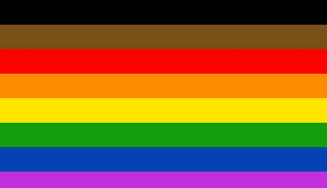
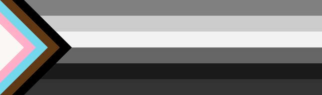
In a project called “Progress: A PRIDE Flag Reboot,” Quasar introduces four extra symbolic hues in the existing six-color pennant. Designed in 1978 by artist-activist Gilbert Baker, the rainbow flag was a conceived as a unifying symbol for LGBTQ communities to “proclaim its own idea of power,” as Baker recounts in the book, Stitching a Rainbow. It was admitted to the Museum of Modern Art’s permanent collection in 2015
Quasar, who is currently running a Kickstarter campaign to produce the new design, wishes to improve on a 2017 rainbow flag redesign revealed at gay pride festivities in Philadelphia last year. Extra black and brown stripes were suggested for that flag as a way to highlight the fight against racism, while honoring “black and brown members of the gay community,” its designers explained.
What Quasar wants to do is salute Gilbert’s original design AND please all parties—an impossible and all-too common designer’s dilemma that often results in mediocrity.
His layout solution: Move the brown and black stripes to the side along with the transgender colors blue and pink formed into a triangle in the corner. “The six stripe LGBTQ flag should be separated from the newer stripes because of their difference in meaning, as well as to shift focus and emphasis to what is important in our current community climate,” he explains.
The intent behind Quasar’s “flag reboot” is noble but his design solution misses the mark.
For one, the 10-color “flag reboot” violates the first rule of flag design: Keep it simple. The North American Vexillological Association expounds on the practicality of simple flags:
Flags flap. Flags drape. Flags must be seen from a distance and from their opposite side. Under these circumstances, only simple designs make effective flags. Furthermore, complicated flags cost more to make, which often can limit how widely they are used. Most poor designs have the elements of a great flag in them—simplify them by focusing on a single symbol, a few colors, large shapes, and no lettering. Avoid the temptation to include a symbol for everybody. (emphasis added)
That last point is key. The rainbow flag’s meaning rests not in its individual colors but in the symbolism of the entire spectrum. Baker described the rainbow’s universal, all-embracing resonance best: “The rainbow came from earliest recorded history as a symbol of hope. In the Book of Genesis, it appeared as proof of a covenant between God and all living creatures. It was also found in Chinese, Egyptian and Native American history.” Adding more colors to the flag results in a weaker overall symbol that arguable promotes factionalism rather than solidarity—division instead of community.
But curator Michelle Millar Fisher, who interviewed Baker when MoMA acquired his original flag, says there’s utility in continuously interrogating its symbolism. “Gilbert [Baker] was an incredibly generous person in general, and as an artist he deliberately did not trademark the Rainbow Flag…I think he definitely left the door open for reinterpretation,” she explains. “If new design provocations like this flag can help important conversations happen, then it is a demonstration of the continuing power of the discipline of design to effect change. More power to that!”