Wikipedia and Apps: A Love Story
By Robin Schönbächler, Carolyn Li-Madeo, Sudhanshu Gautam and Volker Eckl

Designing for mobile apps presents unique challenges and opportunities compared to traditional websites. Mobile apps run natively on a device and have access to system resources that are harder to access within a web based architecture. Key characteristics of apps are:
- Apps are designed to fit with the rest of the operating system. When an app fits in with the rest of the OS, it not only looks and feels more at home, it lowers the users learning curve.
- A deep integration with the OS comes with benefits right out of the box, e.g. accessibility, performance, integration with voice assistants or home screen widgets.
- Offline capabilities and often reduced data usage: offline capabilities allow users to consume content from anywhere, even when they are not connected to the internet or connectivity is low.
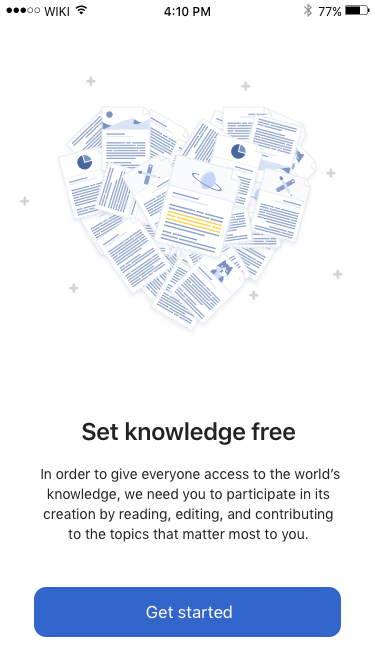
Wikimedia Foundation’s apps are an essential piece to meet our “this is for everyone” design principle. Wikimedia apps are designed with the philosophy of mobile first in mind. One of the core principles of mobile first is to embrace the constraints of a mobile environment and with it, prioritize essential information, as there’s simply not enough room for everything.
Limited connectivity of people in certain areas of the world inspires us to create products that are performant and light on data. When building new features for people using mobile apps, we strive for excellence in user experience and aim to break down complex existing flows and processes.
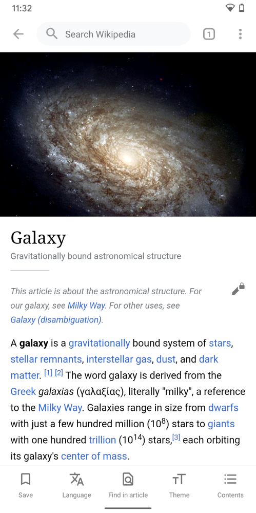
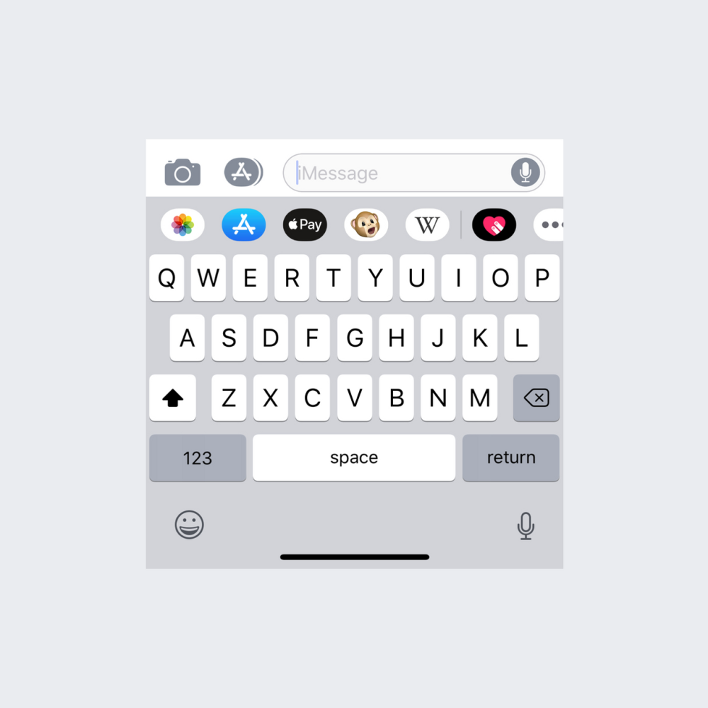
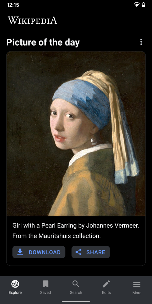
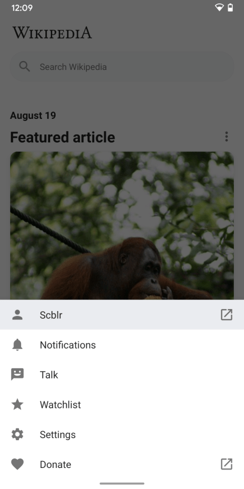
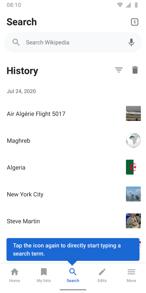
Galaxy Article Android Screenshot,
Robin Schoenbaechler (and Wikipedia contributors),
CC BY-SA 4.0
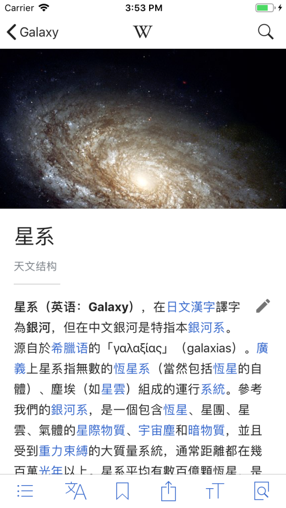
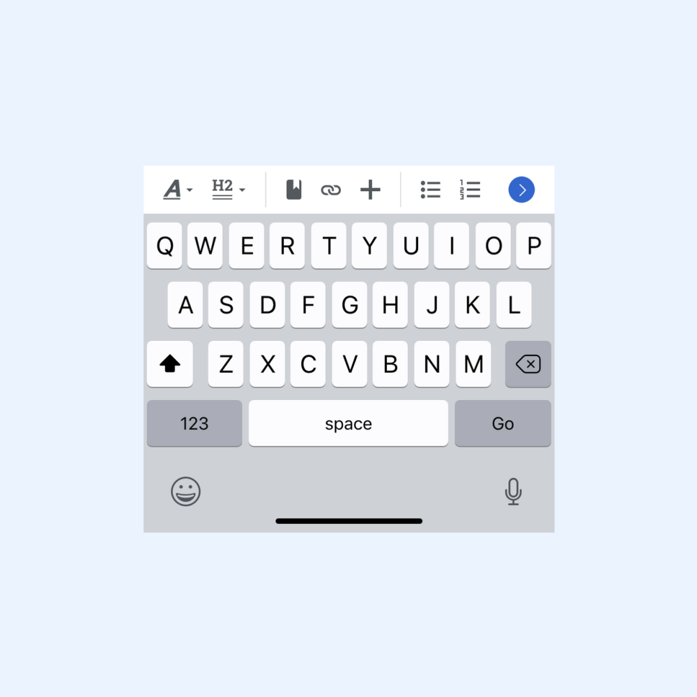
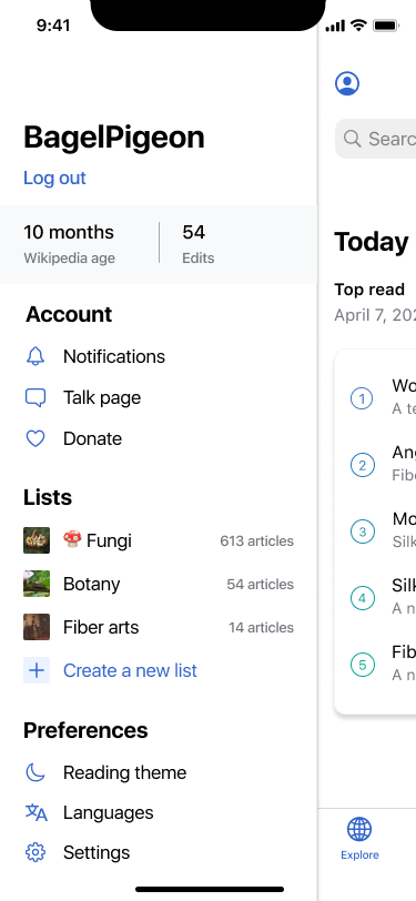
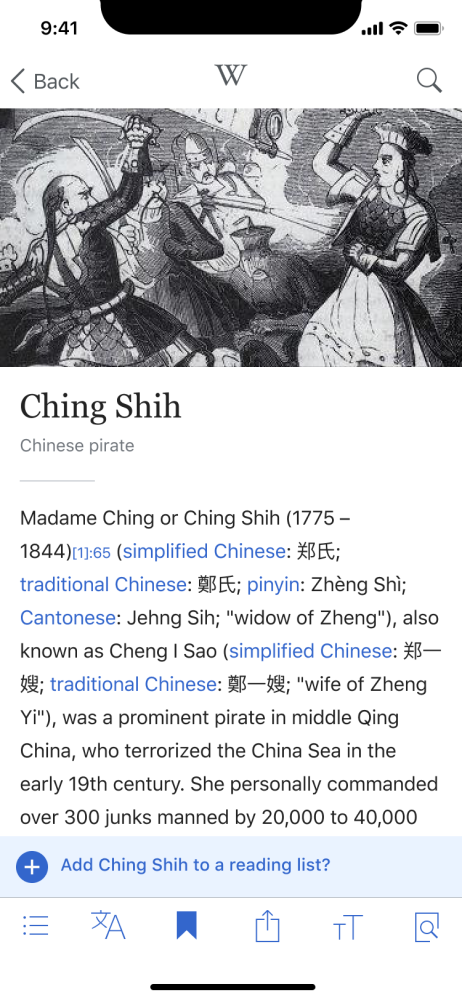
Galaxy Article iOS, Robin Schoenbaechler (and Wikipedia contributors), CC BY-SA 4.0
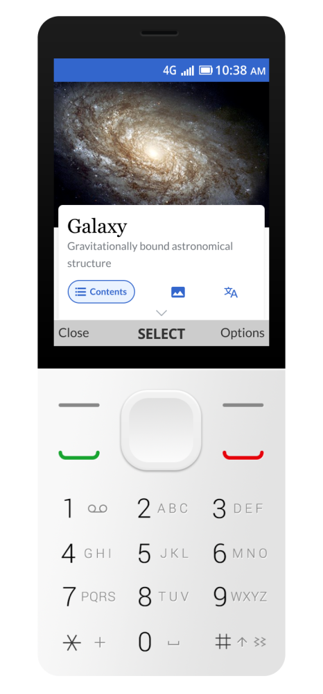
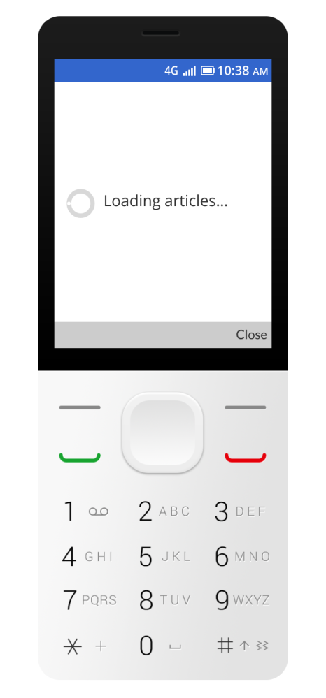
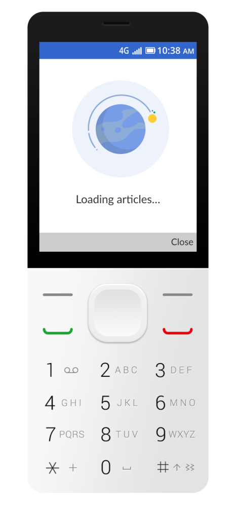
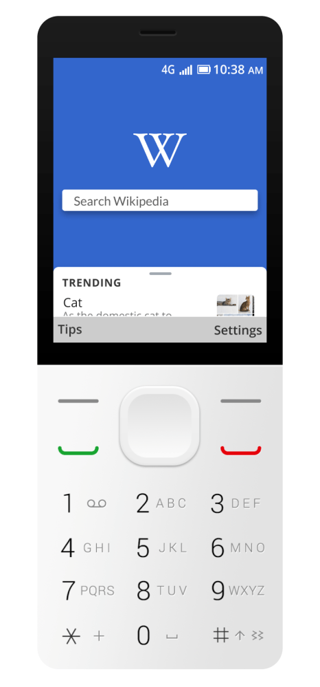
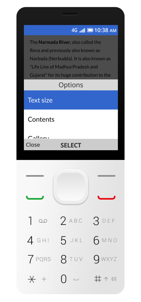
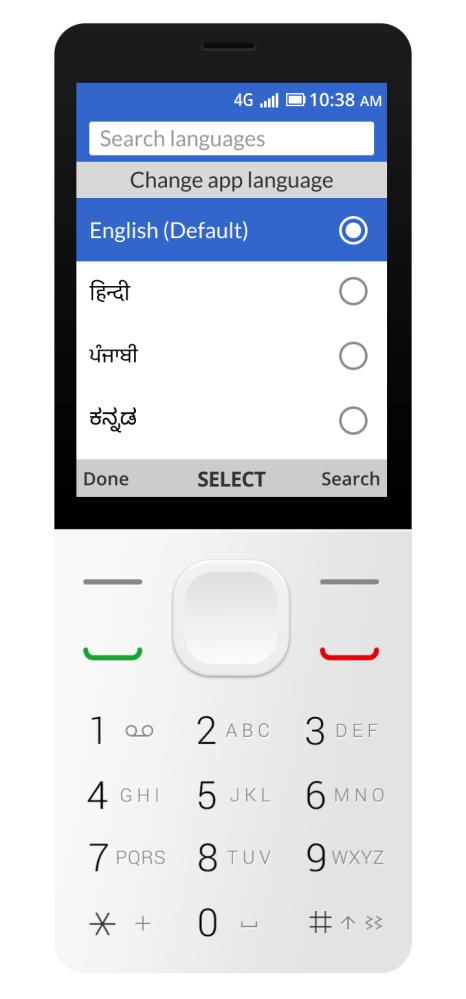
Wikipedia app on kaiOS
Galaxy Article kaiOS, Robin Schoenbaechler (and Wikipedia contributors), CC BY-SA 4.0
Strategy
The apps are here to create mobile first experiences and are not trying to replace existing desktop or community tools. Through the apps, we aim to meet potential users where they are. We are interested in understanding and addressing barriers of those that have been historically left behind, while not compromising the integrity of the workflows of our long-time users on other platforms. Making participation fit naturally the mobile first lives we live.
The apps are a place to experiment. Due to development speed, richer capabilities and unique needs of our user base, we are able to experiment. It is on the apps where we think the future of mobile editing will be discovered. Notably, the apps are where we piloted micro contributions, our most successful editing intervention to this date.
The apps are a forcing function to make our technologies future proof. To provide an example: Right now Wikipedia’s web experience works as a website only and cannot be exported to new mediums. By building on the apps, we create technology that is platform independent and enables next generation experiences. Whether these use artificial intelligence, augmented reality or future technology that is changing our world.
Theming
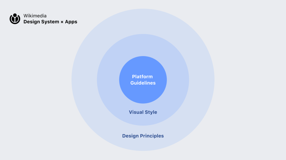
As mentioned in the introduction, iOS and Android both have platform specific guidelines. When building apps for the global Wikimedia movement, our goal is to create native experiences for the specific platform. When designing for mobile apps, guidelines for the platform sit at the top of the hierarchy. Throughout Wikimedia’s product suite, we follow Wikimedia Design’s visual design principles when providing solutions.
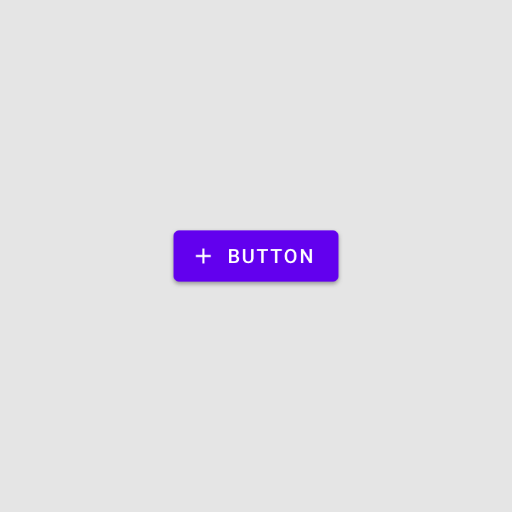
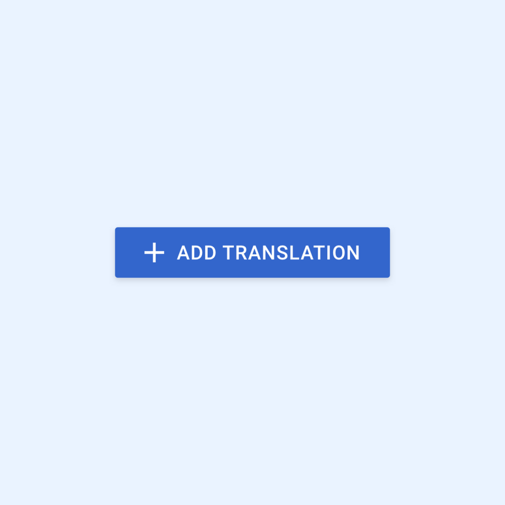
To create a seamless and familiar experience within Wikimedia’s products and services, we apply theming that is based on Wikimedia’s visual style guidelines. Theming allows us to customize the app’s look and feel, to better represent our product’s brand. Theming is reflected in the entire UI, including individual components, like buttons. Here’s an example of applying Material Theming in the Wikipedia Android app:
Without thumbing kaiOS, Robin Schoenbaechler, CC BY-SA 4.0
Theming kaiOS, Robin Schoenbaechler, CC BY-SA 4.0
The design style guide’s color palette is also used in the apps. Since both the Android and iOS Wikipedia app is available in four different reading themes (Light, Sepia, Dark and Black), they are using an enhanced color palette for an optimal reading experience. Check out more details about the color palette for Android or iOS here.
Principles
Focus
Robin Schoenbaechler (and Wikimedia Commons contributors), CC BY-SA 4.0

Robin Schoenbaechler (and Wikimedia Commons contributors), CC BY-SA 4.0
Robin Schoenbaechler (and Wikimedia Commons contributors), CC BY-SA 4.0
How clear is the goal? Based on Wikimedia Design’s “content first” principle, we aim to design apps that are easy to understand and focus on the essentials. When designing, content comes first, control comes second. On mobile, screen real estate is limited, places of usage are unforeseeable and the user’s focus is reduced. We strive to reduce information density while not neglecting an interface’s functional essence. Guiding questions like: What is the essence of this feature? What is the purpose of this particular screen? How much information can be deprioritized (or left out) to convey a UI’s purpose? Clarity stands for designing user interfaces with clear call to actions, generous use of white space, accessible contrast and hierarchy when designing with type or icons. Writing concise and suitable multilingual UI copy supports in reaching their goals more efficiently.
Robin Schoenbaechler (and Wikimedia Commons contributors), CC BY-SA 4.0
Robin Schoenbaechler (and Wikimedia Commons contributors), CC BY-SA 4.0
Where am I? Design for consistency and orientation are key aspects to help users navigate through an interface in a mobile app. We put explicit effort in communicating where users are and where they can go. Spatial awareness in a digital product helps users in achieving goals more directly. This is exemplified by using a consistent navigation, usage of depth and the application of motion. Deliberate usage of animation and transitions help users navigate an interface. Visual layers and realistic motion convey hierarchy, emotion and understanding when using a device.
Robin Schoenbaechler (and Wikimedia Commons contributors), CC BY-SA 4.0
Robin Schoenbaechler (and Wikimedia Commons contributors), CC BY-SA 4.0
How does the design feel on an emotional level? An often forgotten and invisible theme but yet one of the most impactful: emotional design. Along the lines of our ”trustworthy yet joyful” design principle, we believe that preserving the human touch and showing ourselves with our values in our work is essential. Especially on a device that is as personal as your mobile phone. Instead of creating one more cheap and fast mass feature, we follow a philosophy that has been paved by artists, designers, and architects of the arts and crafts movement. After all, we design for humans and strive to create humane and emotional experiences. Through design, we can see and connect with other human beings. To design experiences that are emotional, we consider understanding the needs of the people we are designing for, as the core mission.
Robin Schoenbaechler (and Wikimedia Commons contributors), CC BY-SA 4.0
Robin Schoenbaechler (and Wikimedia Commons contributors), CC BY-SA 4.0
For non-touch interfaces, placement of key actions (e.g. search, read, edit) is important. We linked key actions with commonly used phone keys to make them easy to perform.
Language selector kaiOS, CC BY-SA 4.0
How does the design feel in my hand? Ergonomics, posture, context, and the tactile nature of touch have implications on how users interact with a design. Our design principle “this is for everyone” is part of our core mission and designing for touch is different than designing for a keyboard, mouse or trackpad. When designing for apps, we embrace principles of direct manipulation, an interaction model where effect are immediately visible on the screen to the user. Designing for a touch device goes beyond enlarging buttons for bigger fingers. We deeply consider placement and positioning of elements to achieve an ergonomic user experience while being aware of different device usage types. And, as voice is considered as the most natural machine-human input method available, we make sure the interface reflects it. We design experiences that provide ergonomics on smartphones, tablets and hybrid laptop/touch devices.
Get Involved
The Wikimedia iOS, Android and kaiOS apps are each designed and developed by a specific team to that platform. If you’re interested in learning more about the apps or if you want to get involved, please visit Wikimedia Apps on mediawiki.org.
Android
- Wikipedia for Android project page
- Wikipedia for Android team page
- Wikipedia for Android on Github
- Wikipedia Android on Google Play
- Wikipedia Android App promo video on YouTube
- Android color guidelines
- Google Material Design Guidelines
iOS
- Wikipedia iOS project page
- Wikipedia iOS team page
- Wikipedia for iOS on Github
- Wikipedia for iOS in the App Store
- iOS color guidelines
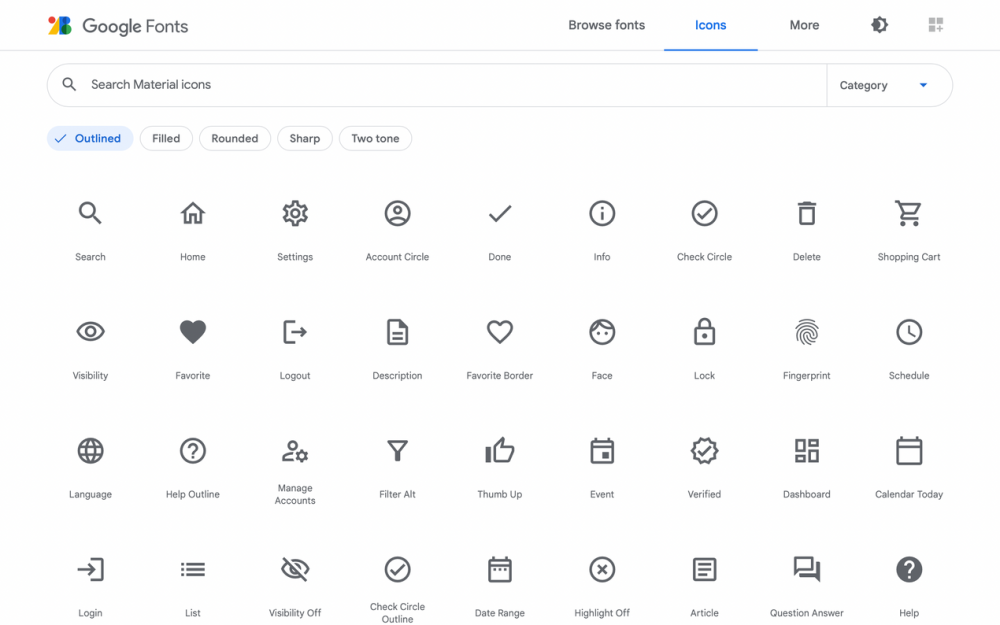
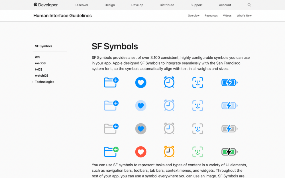
- Apple Human Interface Guidelines
kaiOS
- Wikipedia for KaiOS project page
- Wikipedia for kaiOS on Github
- Wikipedia KaiOS app simulator
- KaiOS documentation
Thanks to Lucy Blackwell, Jazmin Tanner & Josh Minor for their contributions.
About this post
This post first appeared in the Wikimedia Diff Blog on 30 November 2021.
Featured image credit
We love Apps, Robin Schoenbaechler, CC BY-SA 4.0