The British Broadcasting Corporation Coat Of Arms | 1927 - 1988
The BBC's first Royal Charter came into force in 1927. Shortly afterwards the corporation was granted its own Armorial Bearings by the College of Arms. The colour version of the Coat of Arms incorporates the three colours of the BBC's national regions: Blue for Scotland, red for Wales and green for Northern Ireland.
The British lion which forms the 'crest' of the coat of arms holds a thunderbolt with lightning flashes - a heraldic way of representing broadcasting. The eagles ('supporters') on either side of the crest represent speed. They have bugles around their necks to symbolise public proclamation. The globe on an azure shield (the ether) has seven other planets in the sky around it, to reflect the scope and breadth of the corporation. Pluto hadn't been discovered when the arms were completed. The motto is based on verses from the Book of Micah (chapter 4, verse 3) and the Book of Isaiah (chapter 2, verse 4). The original description of the crest says that the lion is also poised on 'a wreath of the colours'.

The British Broadcasting Corporation Coat Of Arms | 1988 - Present
The BBC Coat of Arms was updated in 1988 with the introduction of the new slanted BBC logo designed by Michael Peters (see further down this page). The whole of the Arms properties remain the same, but appear more stylised and defined.

Examples of the BBC Coat of Arms in print and on-screen. BBC News adopted the crest in 1993 using a virtual coat of arms in the opening title sequence.
The BBC Logo | 1960s
The BBC blocks were first introduced in 1959, square blocks with italicised BBC tv type sat within them. The typeface appears to be a variation of the typeface Univers (Helvetica hadn't been designed yet).

A few years later, in 1964 subtle changes were made to the logo blocks. With the introduction of a second tv channel - BBC2, the logo blocks were italicised to match the angle of the BBC tv type.

 BBC Production - Production Caption
1966
 The BBC introduces a real novelty here - animated production captions. They were used at the end of 'The War Game', made in 1965 but not shown until 1985.
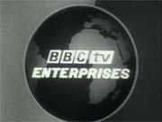
 BBC tv Enterprises - Production Caption
1960s
 A straight forward zoom of the words against a revolving globe. (this clip has no sound)
The BBC Logo | 1970s - 1988
In 1972 the BBC blocks were rounded off, and spaced out apart from each other to be more fashionable for the period.

Examples of the BBC logo in print and on-screen.
 Lionheart Television - Production Caption
1970s
 Lionheart Television was the BBC Enterprises distributor brand in the United States of America. This ident is from the end of an episode of 'The Good Life'. A very rustic look for Lionheart Television in the 1970s. The lion holding the lighning bolt from the BBC Coat of Arms is used as Lionheart's new symbol.
 Lionheart Television - Production Caption
1980s
 A drastic makover for Lionheart Television, which judging from the graphics look like they are from the early 1980s.
 BBC Video Ident
1983
 BBC Enterprise's commercial ident which would preceed a BBC production sold on videotape during the 1980s.
The BBC Logo | 1988 - 1997
In 1988 the BBC introduced a new logo. They commissioned Michael Peters to produced a new identity to boost a more cohesive identity across the BBC's output. The boxes were sharpened up once again and slanted to 17 degrees with three coloured stripes added underneath, these colours represented Scotland, Wales and Northern Ireland aswell as being the red, green and blue phosphors of colour television pictures.

Guidelines for the BBC logo from 1988
 BBC Lionheart Television - Production Caption
1988
 The famous BBC1 COW symbol is adopted by BBC Lionheart Television and reworked to give a much more up-to-date image for Lionheart in the late 80s
 BBC Worldwide Americas - Production Caption
1990s
 By the 1990s BBC Lionheart Television had changed its name to BBC Worldwide Americas. The date of the rebrand is not known, though our clip is sourced from a recording made in 2002.
The BBC logo applied in print, on screen and across merchandise.
The BBC Logo | 1997 - Present
In the autumn of 1997, Saturday October 4th the BBC introduced a brand new logo to coincide with the launch of the new digital channels. The new logo was designed by Martin Lambie-Nairn the creative solution was to abandon the angled logo in favour of upright boxes, using the classic gill sans typeface and scrap the lines underneath the logo. Lambie-Nairn said, "the slanting logo always looked uncomfortable when used with other BBC brand names. The choice of typeface designed by Eric Gill is particularly appropriate for the BBC. The sculptured panels and Prospero and Ariel statue which adorn Broadcasting House were created by Gill in the 1930s. And by choosing a typeface that has stood the test of time, we avoid the trap of going down a modish route that might look outdated in several years time."
The cost of changing the logo was estimated at �1.7m a year over a three year implementation period. Director of corporate affairs Coline Browne said, "A number of factors combined to make this the right time to review the BBC's corporate identity. The existing logo doesn't work well on screen, and designers have always found it difficult to apply... We had to get this right before we launched our new digital services, and create a blueprint which can be applied easily and cost-effectively to a range of services in the future. Also in an increasingly crowded market place, we needed to make sure that the BBC is clearly branded and that we get credit for what we do. Research showed that large sections of the audience did not understand that the programme they enjoyed were produced by the BBC and funded by the licence fee... The greater simplicity of the logo, a reduction in the number of colours and its ease of application on screen will mean significant savings. Our target is to fully recoup the cost of these changes over eight years and we are determined to achieve that." (quotes taken from BBC internal memo 14/05/97)
Talking about the old logo Dave Howe, creative director in TV Promotions said, "It was not designed with today's screen uses in mind. In Presentation, where we use it more than anybody else, it has been a real problem... Reduced in size, the fine coloured lines underneath the boxes disappear, and so do the counters (the little bits in the middle of the letters)." Ethan Ames, Head of Graphic Design also said, "Diagionals are one of the worst shapes to deal with on screen, because the pixels which create the colours are lined up in rows and columns, like boxes in a crossword puzzle. Diagonal lines do not fit naturally into the arrangement, they start stepping, which means we have to anti-alias them [a method of filling in the pixels around the original shape in a softer colour to give the impression of a smoother line] (quotes from Ariel October 1997)

Artwork guidelines for the BBC logo
Examples of the BBC logo in print and across other media.


